Blue Tongue
A modern identity for a neighbourhood favourite.
Blue Tongue is known for its warm atmosphere, honest food and strong community ties. The refreshed brand identity was designed to honour that character while giving the venue a more cohesive, contemporary presence across print, digital and in‑venue touchpoints.
The brand direction is grounded in warmth, familiarity and a subtle coastal influence. Its visual language draws from the venue’s interior palette - rich timber, exposed brick, black leather seating and soft greys and creams - creating an earthy, timeless aesthetic that reflects Blue Tongue’s values of approachable food, friendly service and relaxed neighbourhood charm. A refined blue, inspired by the venue’s namesake, adds a gentle coastal reference and modernises the palette. It acts as a visual anchor across menus, signage, social media and the website, strengthening recognition for locals while creating a welcoming first impression for new visitors.
Deliverables
Brand Identity
Motion Design
Copywriting
Integrated Campaigns
Art Direction
Website Design
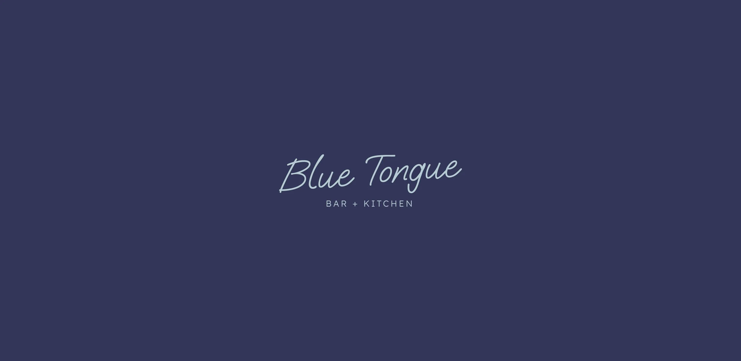
The refreshed branding strikes a careful balance between continuity and evolution. Central to this is the new logo, which preserves the hand‑written, casual spirit of the original. This disarming, friendly style reflects Blue Tongue’s welcoming ethos and relaxed neighbourhood charm. As part of the rebrand, we also introduced a new descriptor - “Bar + Kitchen” - replacing the previous “Wine Bar” tagline. With new owners steering the venue toward a broader, more inclusive offering, this shift communicates the updated direction clearly and confidently. It positions Blue Tongue as a place for great food as well as drinks, without losing the laid‑back feel locals know.
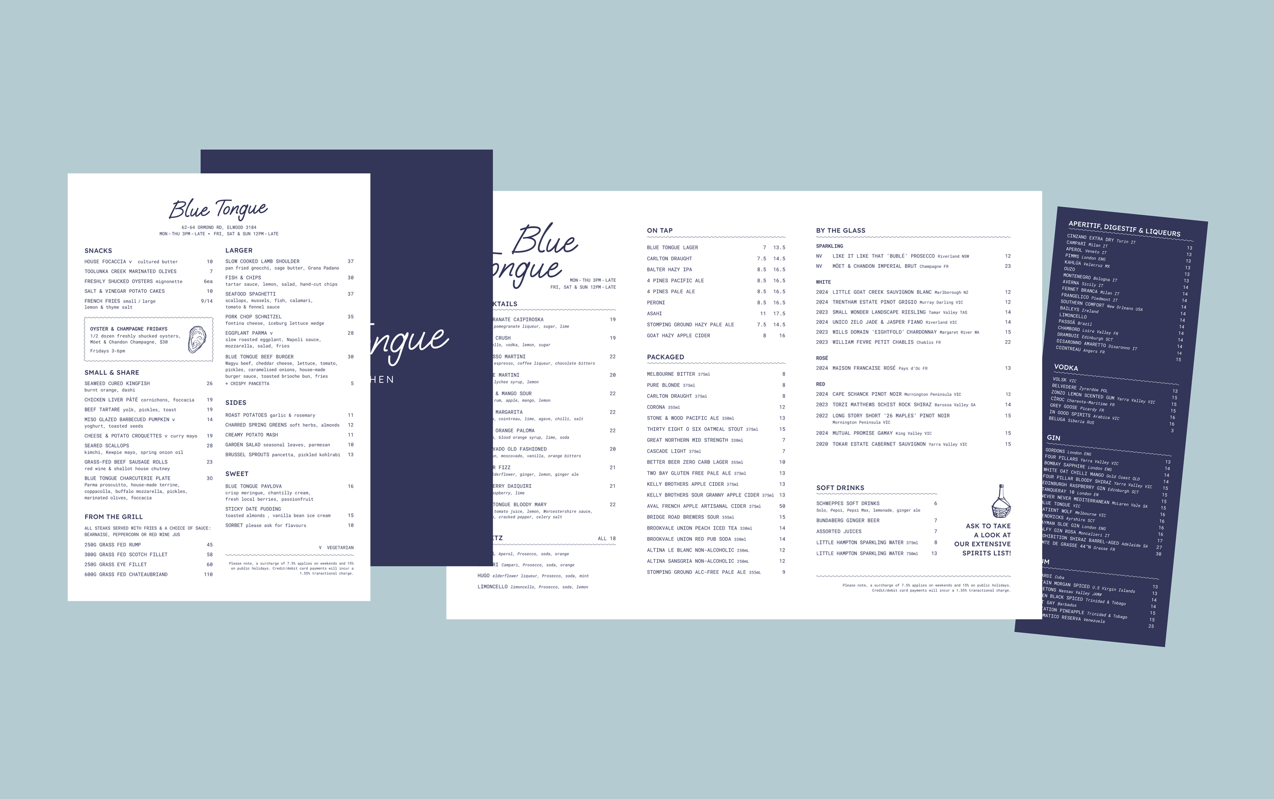
Typography, layout and menu design were rebuilt with clarity and usability in mind, especially for high‑traffic hospitality environments. The result is a cohesive identity system that feels relaxed, inviting and unmistakably local.
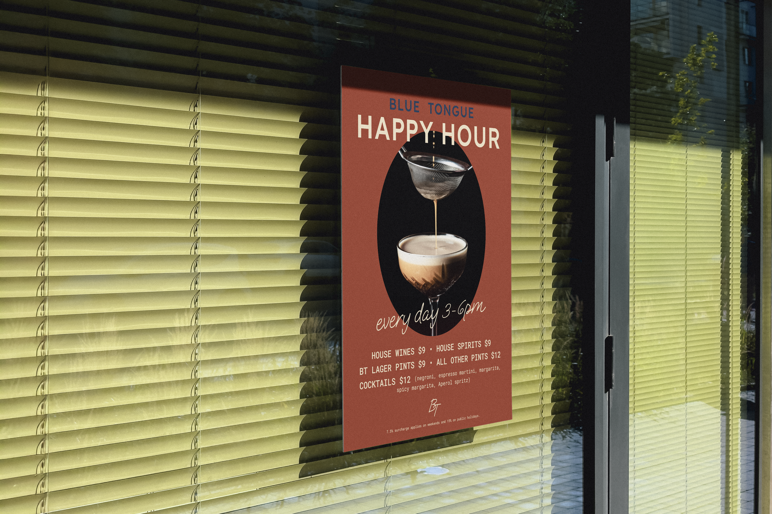
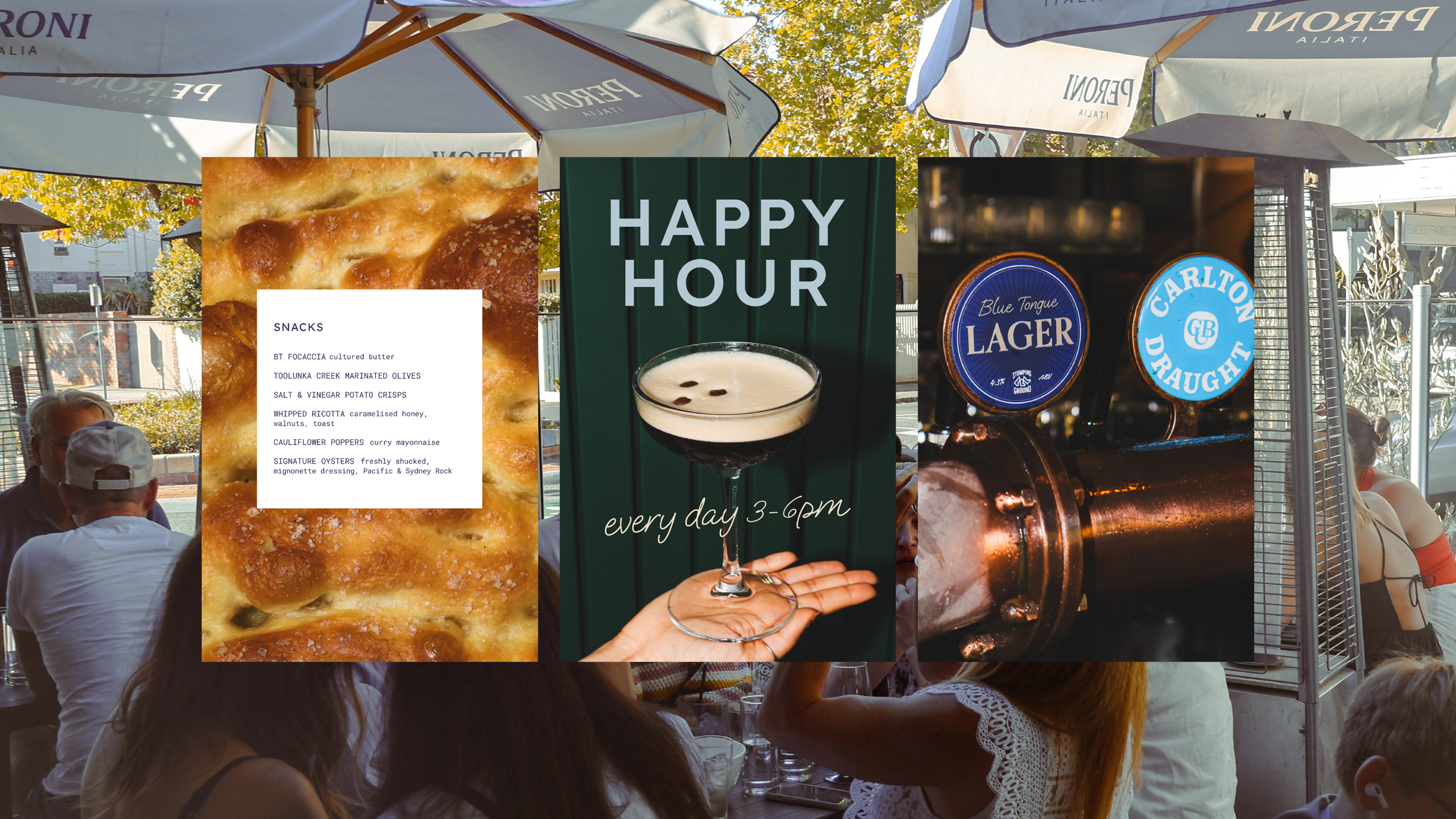
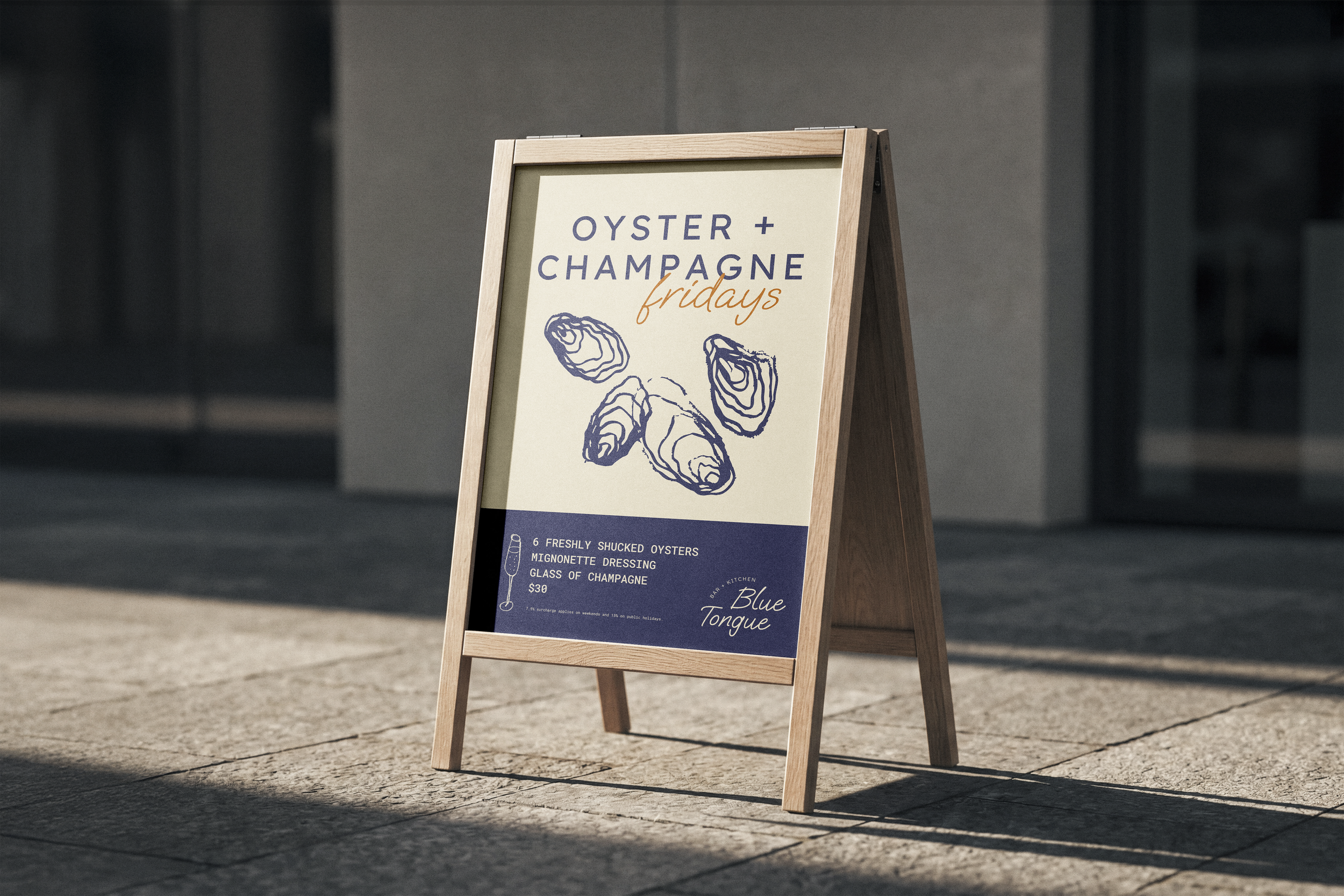
Beyond the core rebrand, the design direction extends into ongoing hospitality campaigns - including weekly specials, live music, seasonal events and promotional content. Each campaign uses the same approachable palette, typography and hand‑drawn illustrations to maintain consistency and warmth across all touchpoints.
The website was designed to mirror the venue’s ethos: simple, welcoming and easy to navigate. Clear structure, minimal styling and a focus on good content reflect Blue Tongue’s approach to food - uncomplicated, high‑quality and made for the community. The site supports both locals looking for quick information and new visitors exploring the menu, events and atmosphere.
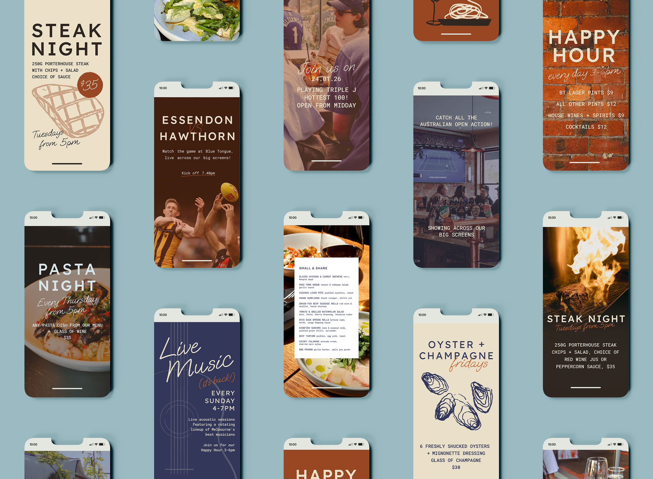
Together, the refreshed identity, website and ongoing campaign design create a unified brand experience that feels modern yet familiar - a true reflection of Blue Tongue’s neighbourhood charm.
Photography: Amy Thompson, Ashleigh Fernandez