Jessica Fern Counselling Psychotherapy
A nurturing brand identity created to make reaching out for support feel easier.
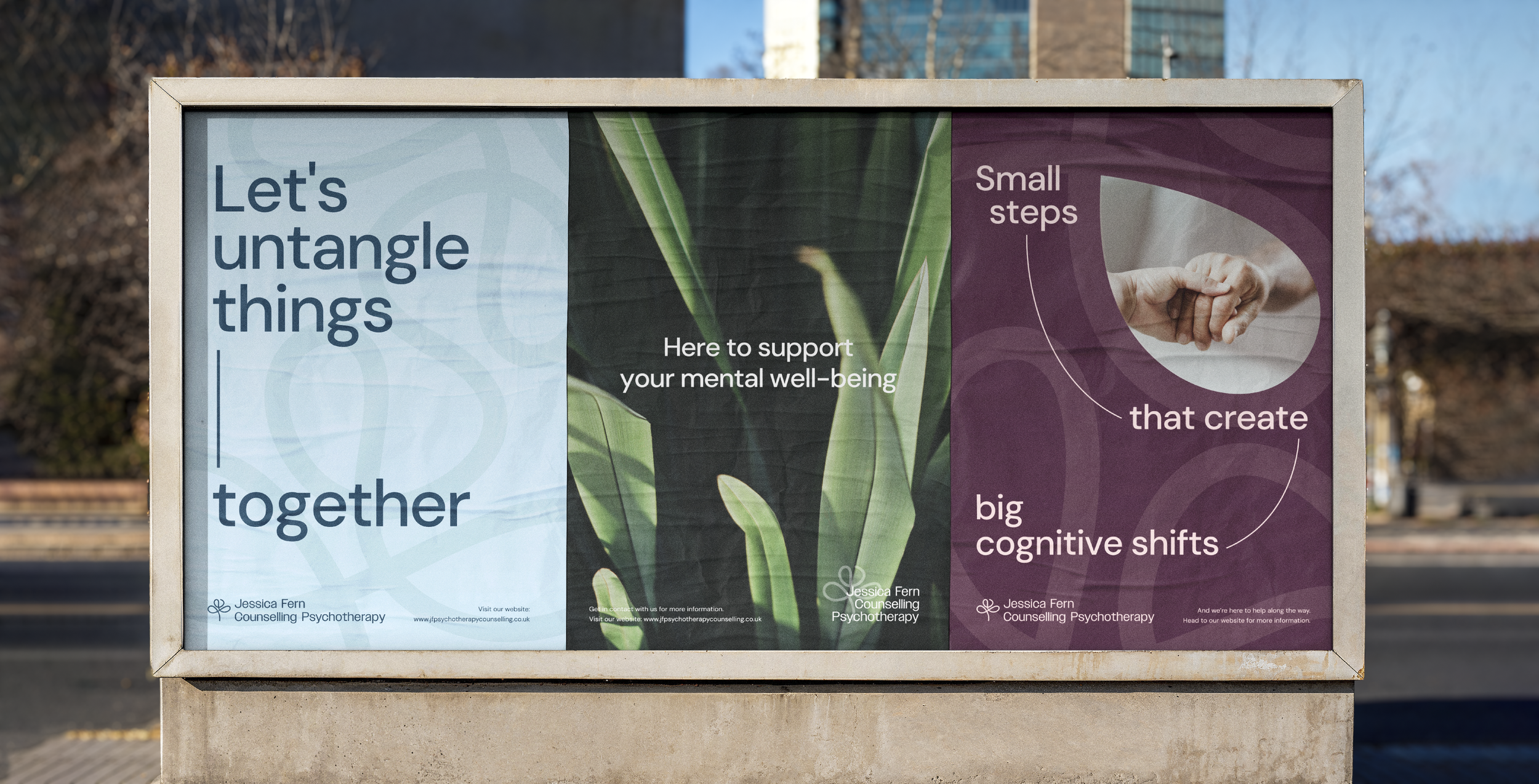
Jessica Fern Counselling Psychotherapy approached us to evolve their existing identity into a brand that felt calm, welcoming, and approachable - recognising that reaching out for support can often be the hardest part of the therapy journey. The aim of the rebrand was to create a visual system that puts people at ease from the very first interaction, whether through the website, social media, printed materials, or everyday brand touchpoints.
Deliverables
Brand Identity Refresh
Custom Logo
Website Design
Copywriting
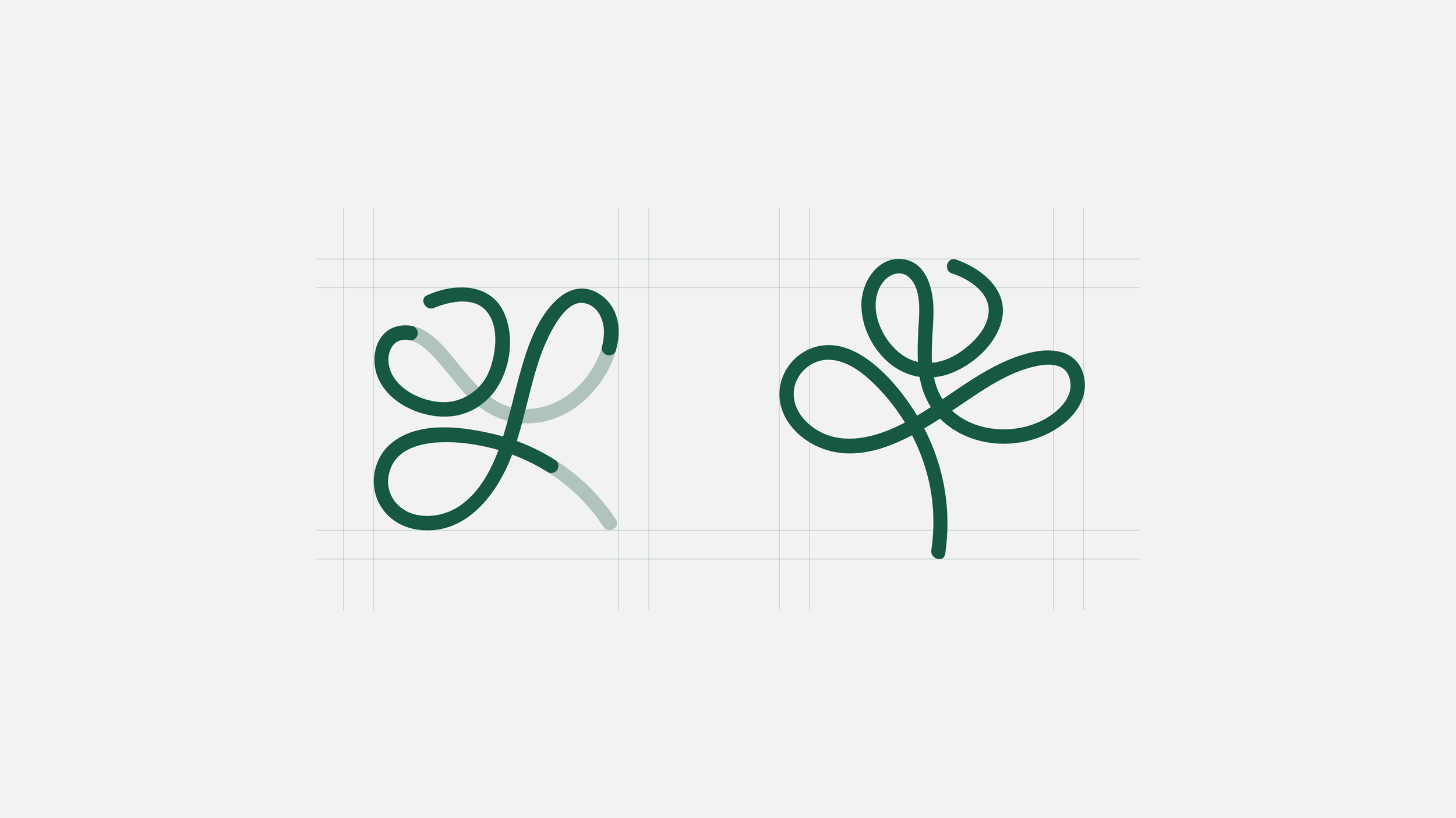
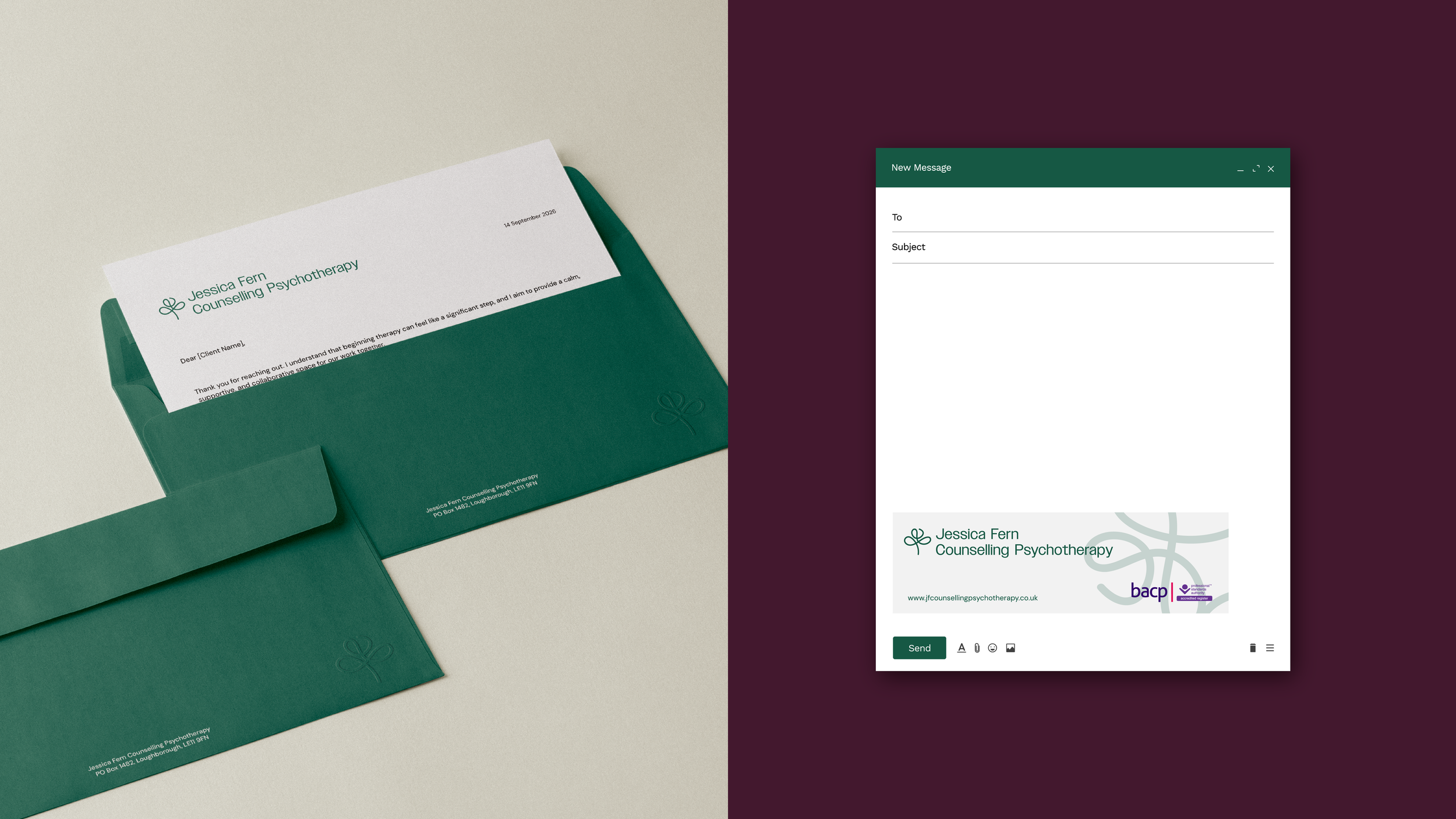
Building on the foundations of the existing identity was an important part of the process. The client wanted to retain both the established green palette and the recognisable “JF” monogram, alongside the floral and foliage-inspired imagery already associated with the practice. Through multiple rounds of sketching and exploration, we developed a signature-style “J” and “F” monogram that, when rotated, subtly forms the shape of a growing plant or budding flower - symbolising growth, nurture, renewal, and personal development. This allowed the brand to evolve naturally while maintaining continuity with the original identity.
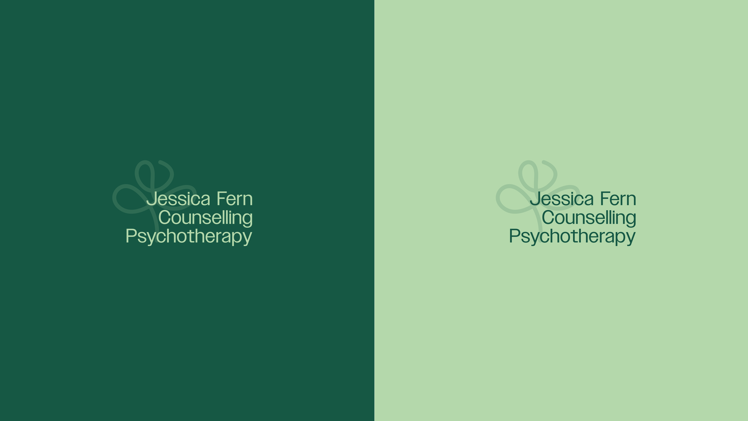
Typography throughout the identity was intentionally kept minimal and uncomplicated, using only two clean sans serif typefaces across the entire brand system. This decision reflects both the modern clinical setting and the practice’s approach to therapy: accessible, clear, and human. Understanding that clients often arrive already carrying emotional overwhelm, the visual identity avoids unnecessary complexity in favour of simplicity, clarity, and ease of use.
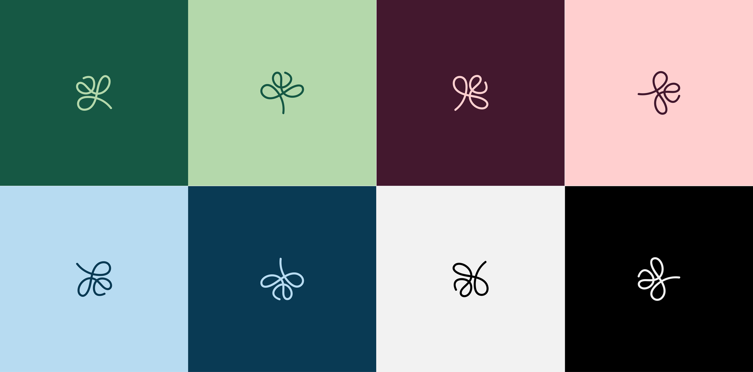
Colour played an important role in reinforcing this feeling. Green remains at the forefront of the palette as requested by the client, supported by rich plum tones, deep navy shades, and lighter accents to create a visual balance that feels grounding, comforting, and emotionally warm.
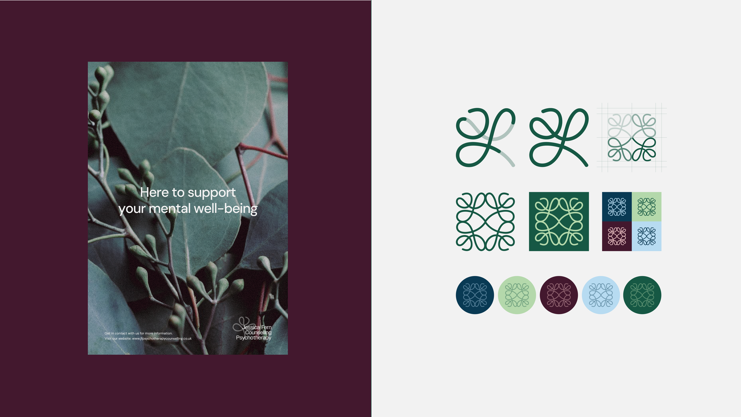
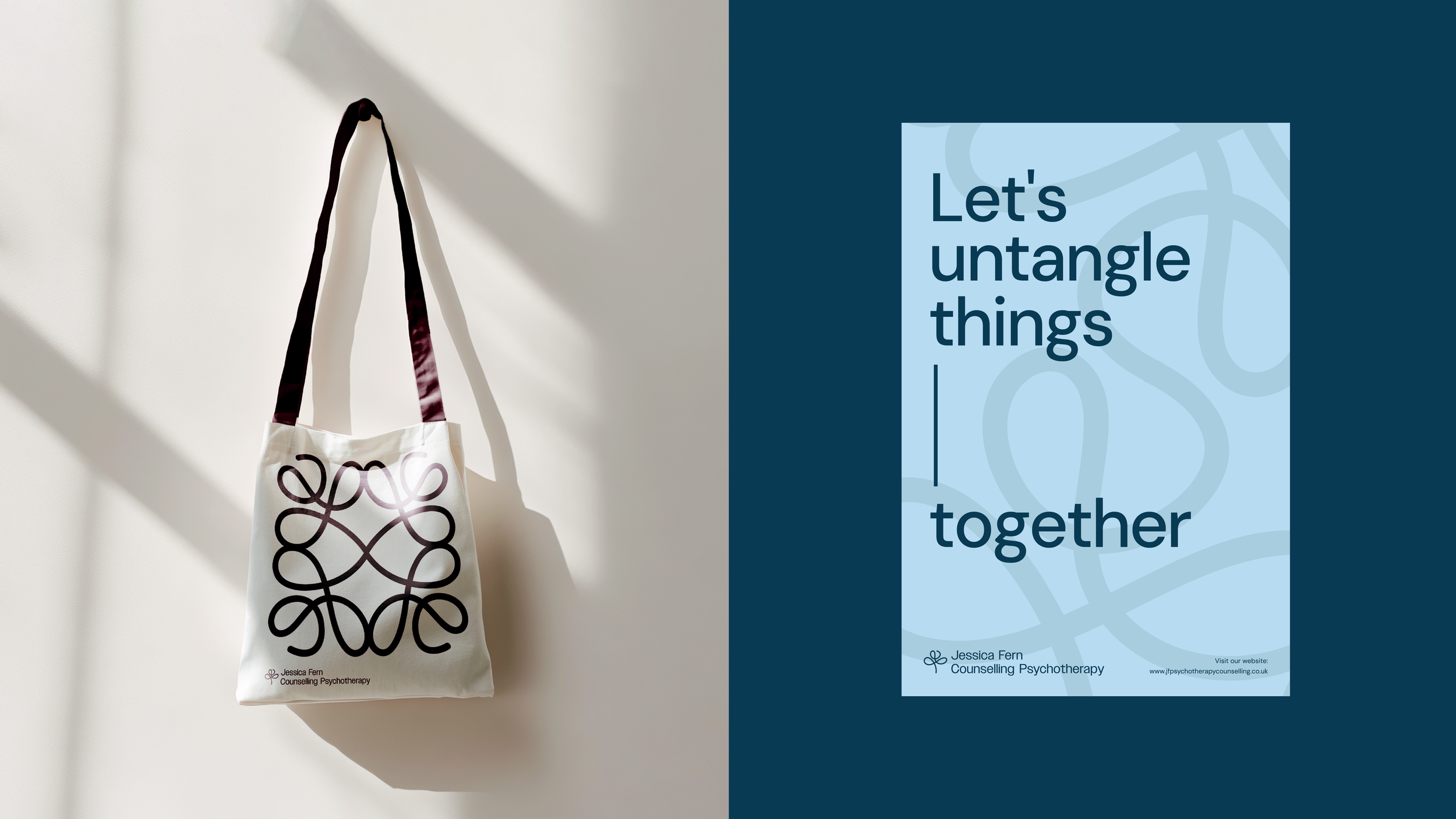
The logo exploration also led to the development of an extended visual asset system. By duplicating and mirroring the flowing monogram form, we created an abstract line-based graphic language that resembles a maze, pathway, or interconnected thought pattern. These forms represent the process of therapy itself - working through complicated thoughts, emotions, and experiences over time. The continuous line creates a sense of movement and progression, reflecting both the active work involved in therapy and the idea that there is always a path forward, even through complexity.
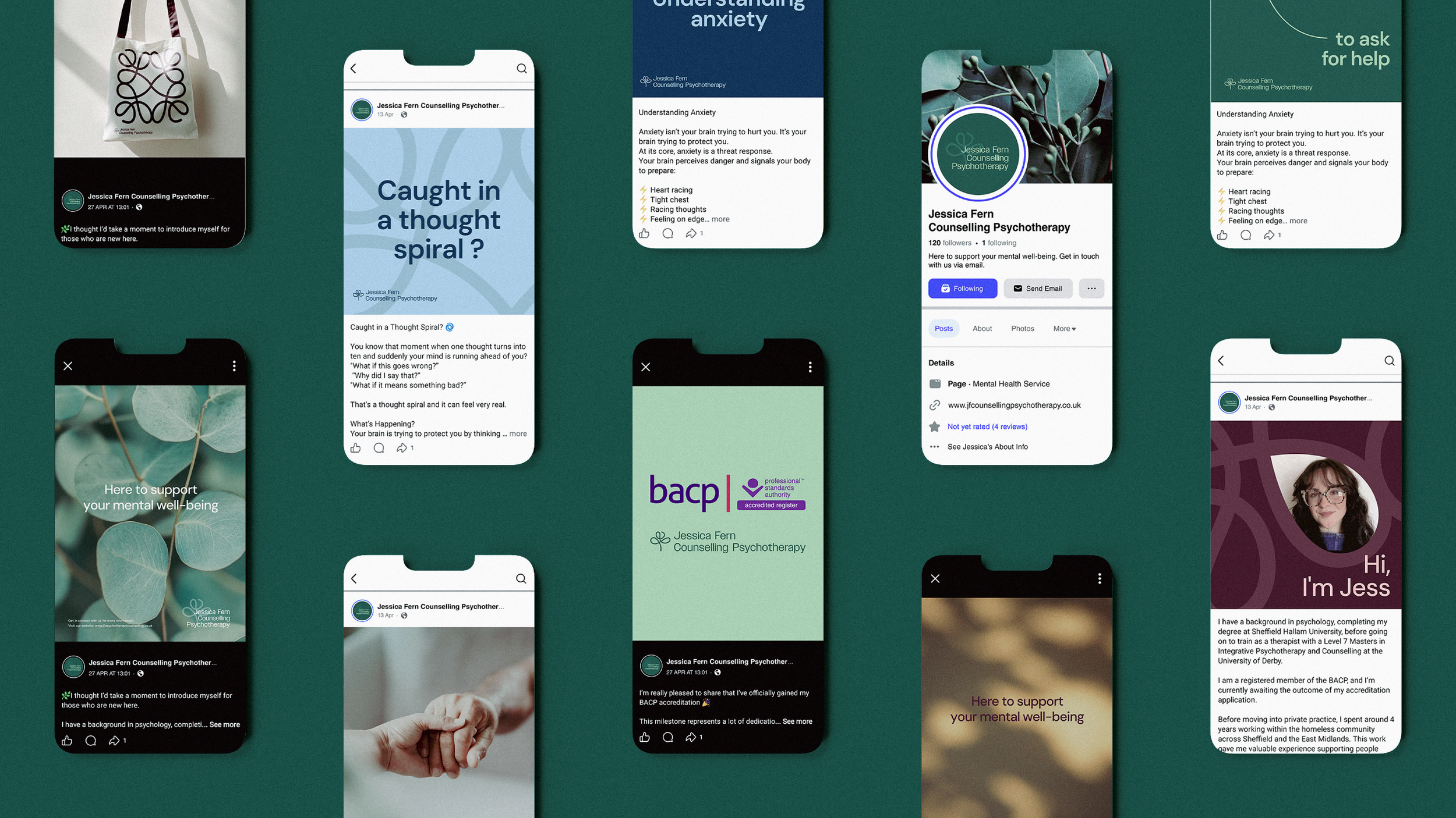
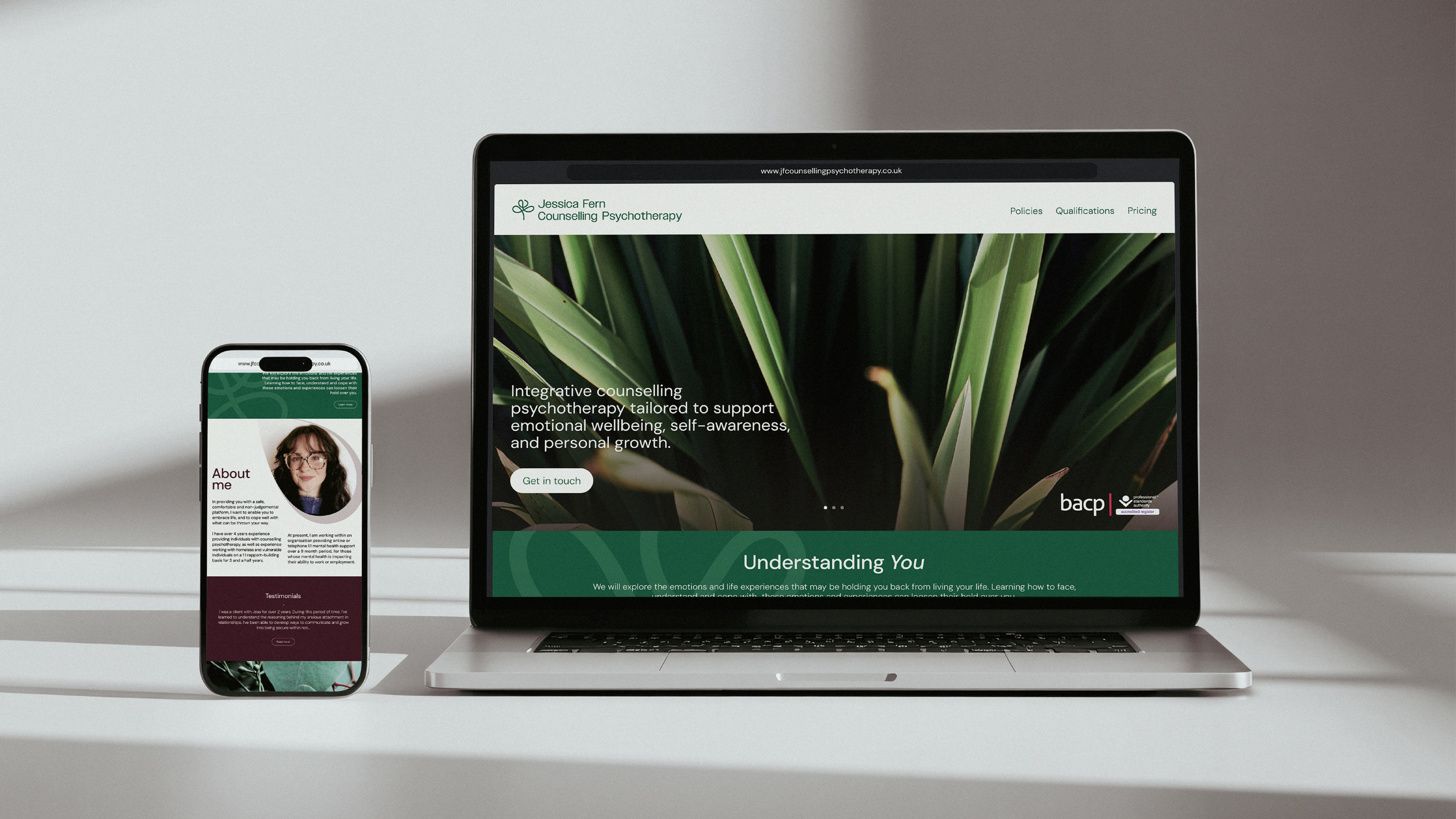
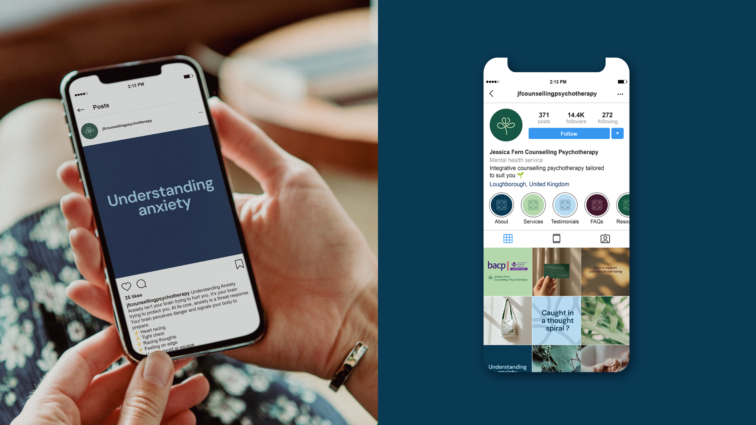
As the brand moved into digital applications, the focus remained on clarity, accessibility, and reassurance. Social media templates were developed to support the practice’s existing advice-led and reflective content, helping create further moments of calm and connection within the brand experience. The website was redesigned with a simplified structure and intuitive navigation, removing overly clinical language and prioritising human connection - encouraging people to begin conversations and seek support without feeling intimidated by the process.