Ludlow
Injecting personality, play and presence.
Ludlow approached us following a recent refurbishment, with a brand that felt visually cohesive but ultimately too restrained for the kind of venue they wanted to be. While the foundation was strong, it leaned heavily on a singular sage green palette and lacked moments of personality. Our focus became introducing warmth, playfulness, and recognisable brand touchpoints that could live naturally across the customer experience.
Deliverables
Brand Identity Refresh
Print Design
Motion Design
Copywriting
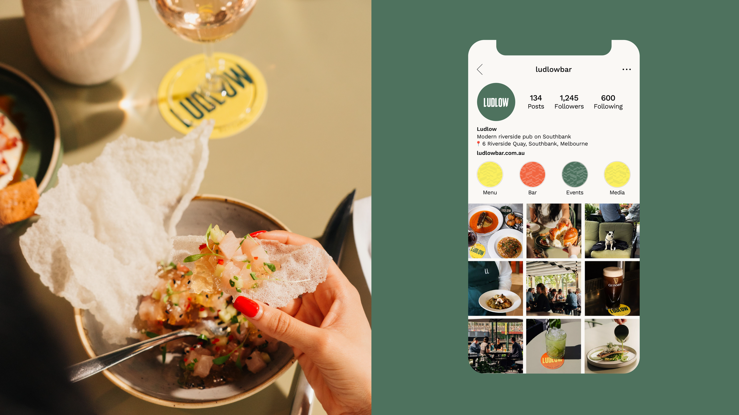
A key move was evolving the existing wordmark into a simplified “LL” emblem. Extracted directly from the Ludlow logo, the mark became a flexible and recognisable icon that could sit beyond traditional brand applications. It was designed to work seamlessly across glassware, menus, social content, and embroidered uniform details — creating consistency without feeling overly branded or rigid.
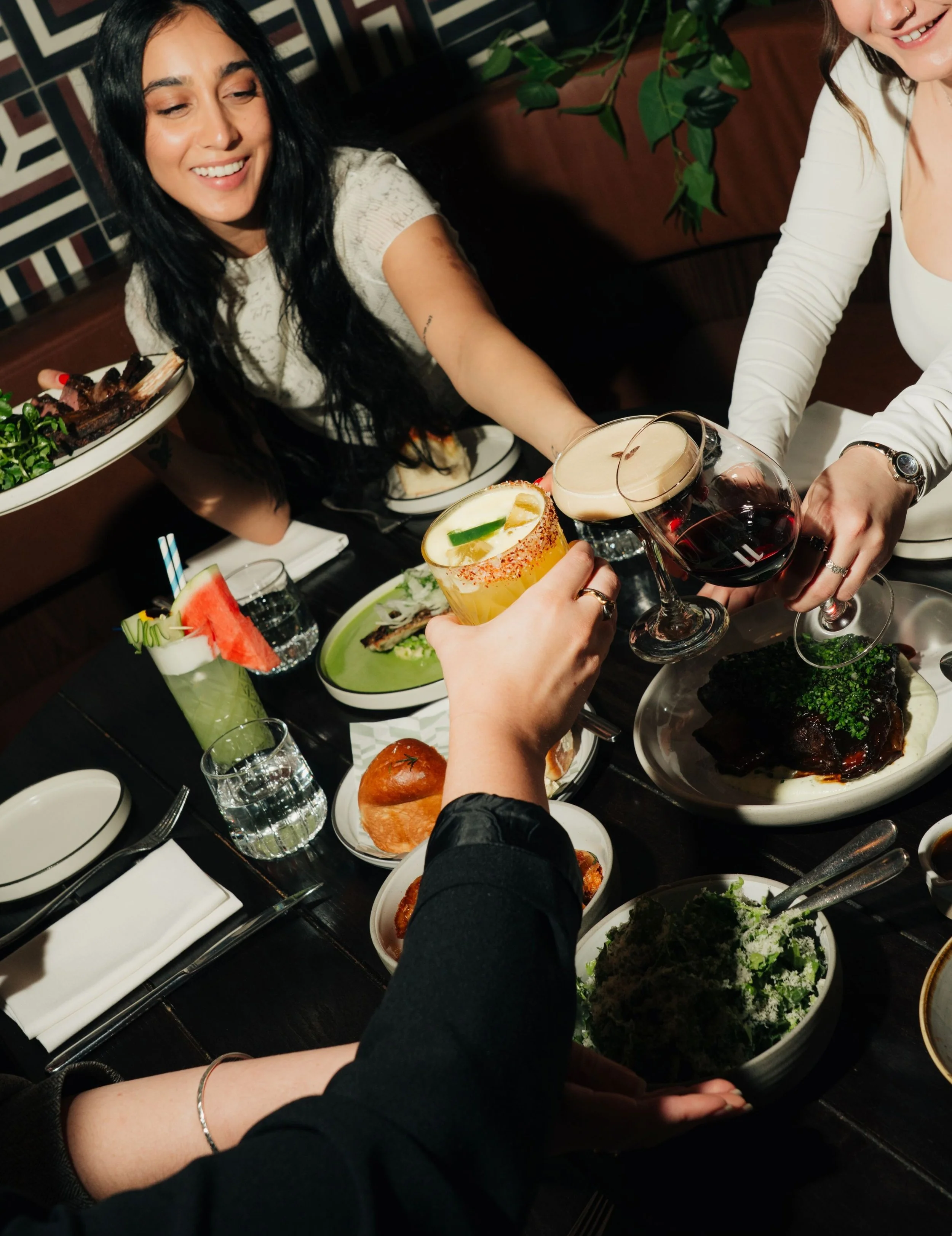
From there, we developed a series of coasters that acted as small, tactile brand moments. This was an opportunity to inject both colour and tone of voice into the experience. Moving beyond the core palette, we introduced sharp hits of lemon and tangerine — bright, almost neon accents designed to cut through the dominant sage green, while still complementing it.
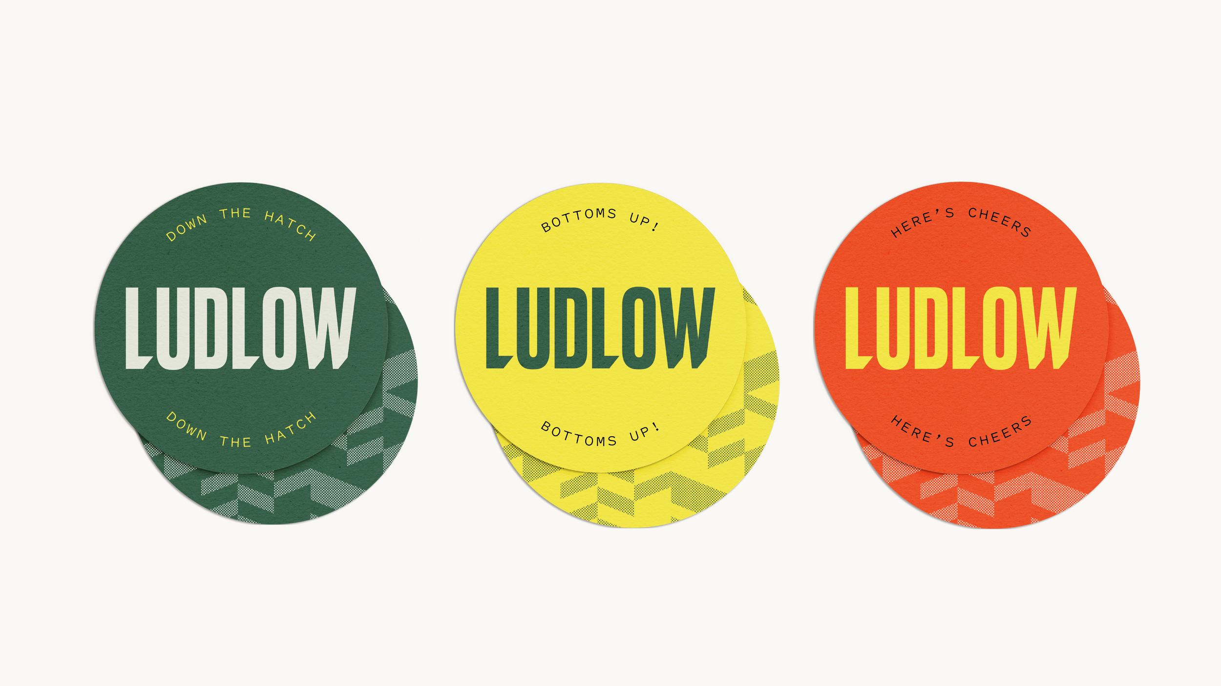
The challenge was finding a balance where these colours could bring relief to the previously over-saturated green palette, without feeling disconnected. Given the scale of the coasters, these pops worked as subtle but consistent bursts of energy across the venue. Paired with playful phrases like “Bottoms Up!” and “Here’s Cheers,” they brought a sense of lightness — creating a moment of interaction each time a drink was set down.
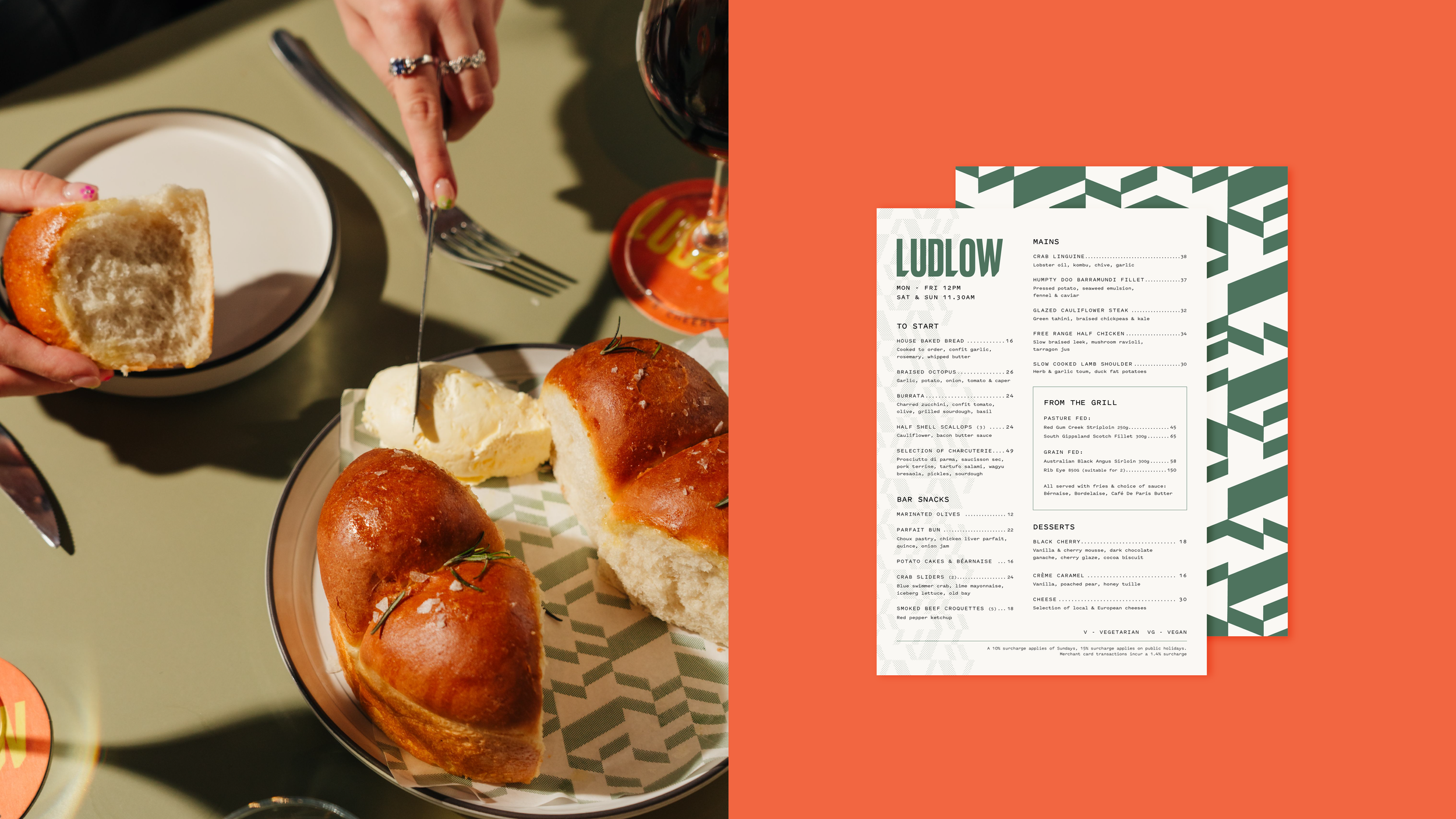
Supporting this system, we created an angular geometric pattern derived directly from the Ludlow letterforms. By isolating the directional cuts within the “L” and the angled terminals of the “W,” we built a repeating graphic motif that felt intrinsically tied to the brand. This pattern became a versatile secondary element, used across menus, coasters, social assets, and operational materials — introducing movement, texture, and another layer of visual personality without overpowering the core identity.
Photography: Dylan Kindermann, Ashleigh Fernandez