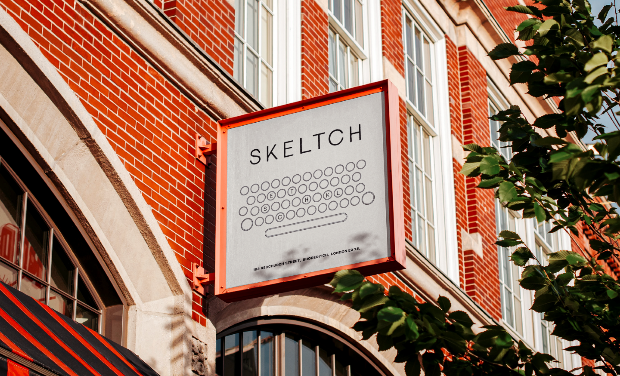
Skeltch
For the marks humans make.
SKELTCH is a contemporary stationery brand built on the raw, tactile beauty of analogue tools. Created for the DesignerBriefs challenge, the brief called for a brand aimed at “stationery purists” - people who value simplicity, quality materials, and the physical act of making marks. The identity needed to feel honest, crafted, and rooted in the fundamentals of writing and drawing.
Deliverables
Brand Identity
Packaging
Copywriting
Motion Design
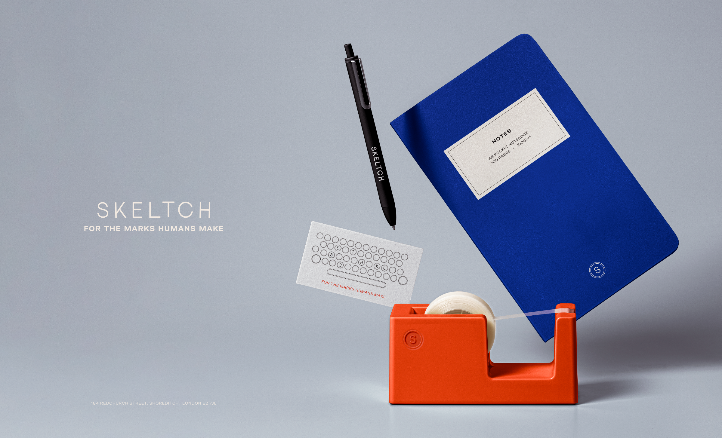
Rather than drawing inspiration from the output of analogue tools, the identity looks instead at the tools themselves, specifically typewriter keys. These keys were once hand‑carved, imperfect objects touched by human hands thousands of times. They carry the marks of use, pressure, and craft. This became the foundation of the SKELTCH logo.
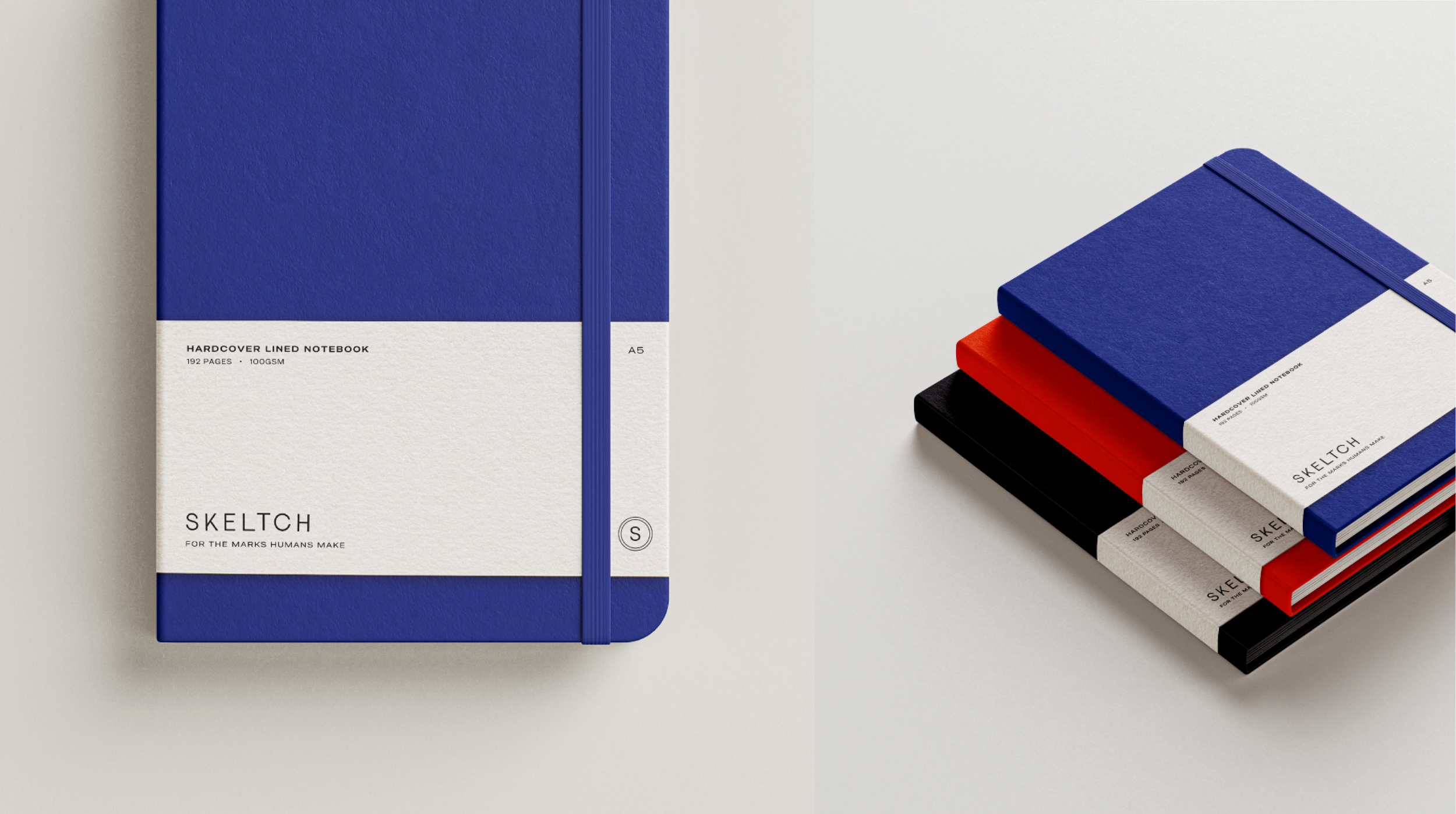
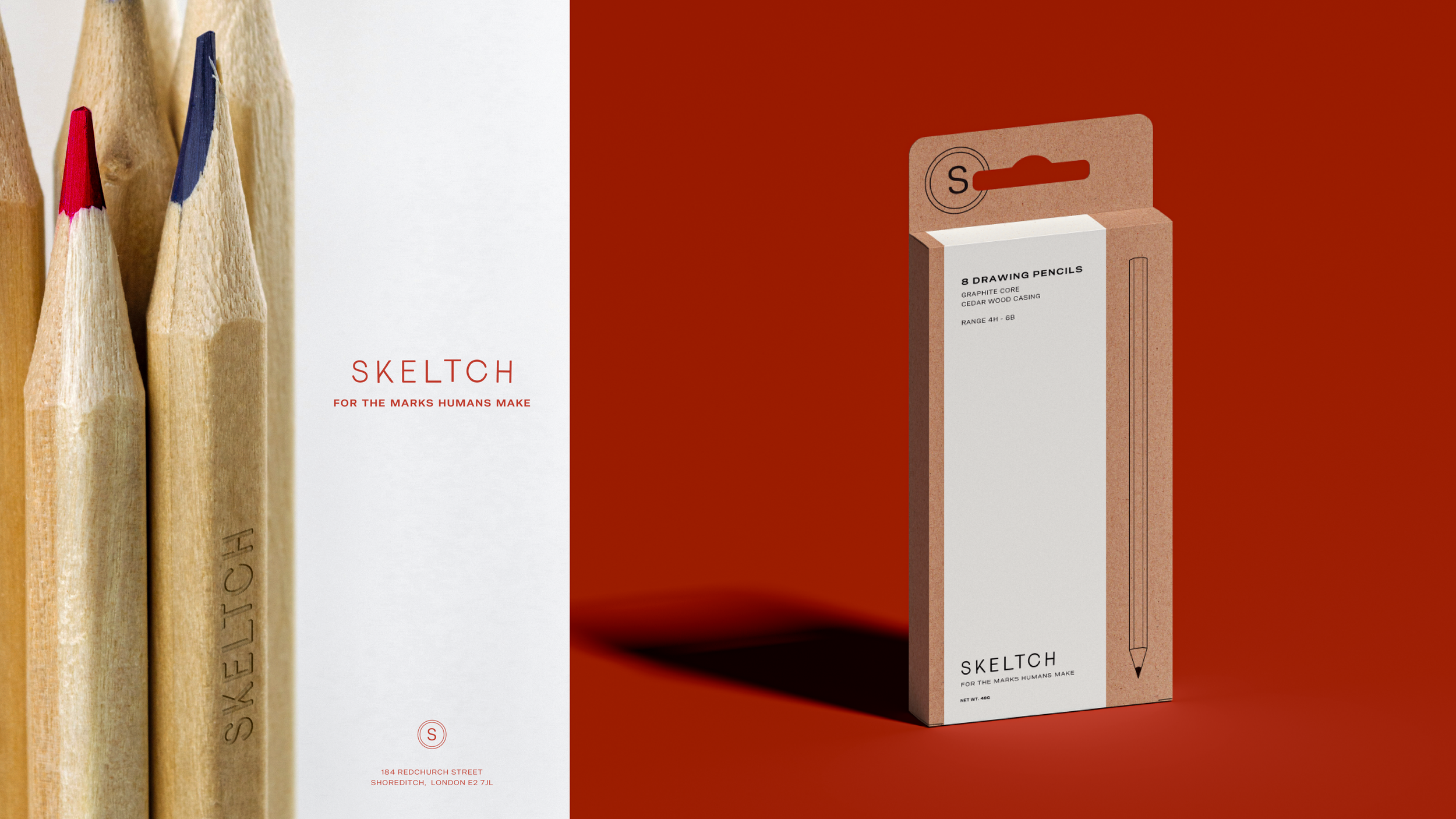
The concentric‑circle key forms evolve into a flexible brand pattern, used across tissue paper, notebook inlays, packaging, and printed collateral. Within this pattern, the letters of SKELTCH are subtly embedded in a QWERTY keyboard layout - a hidden detail that rewards closer inspection and deepens the connection to the brand’s analogue roots.
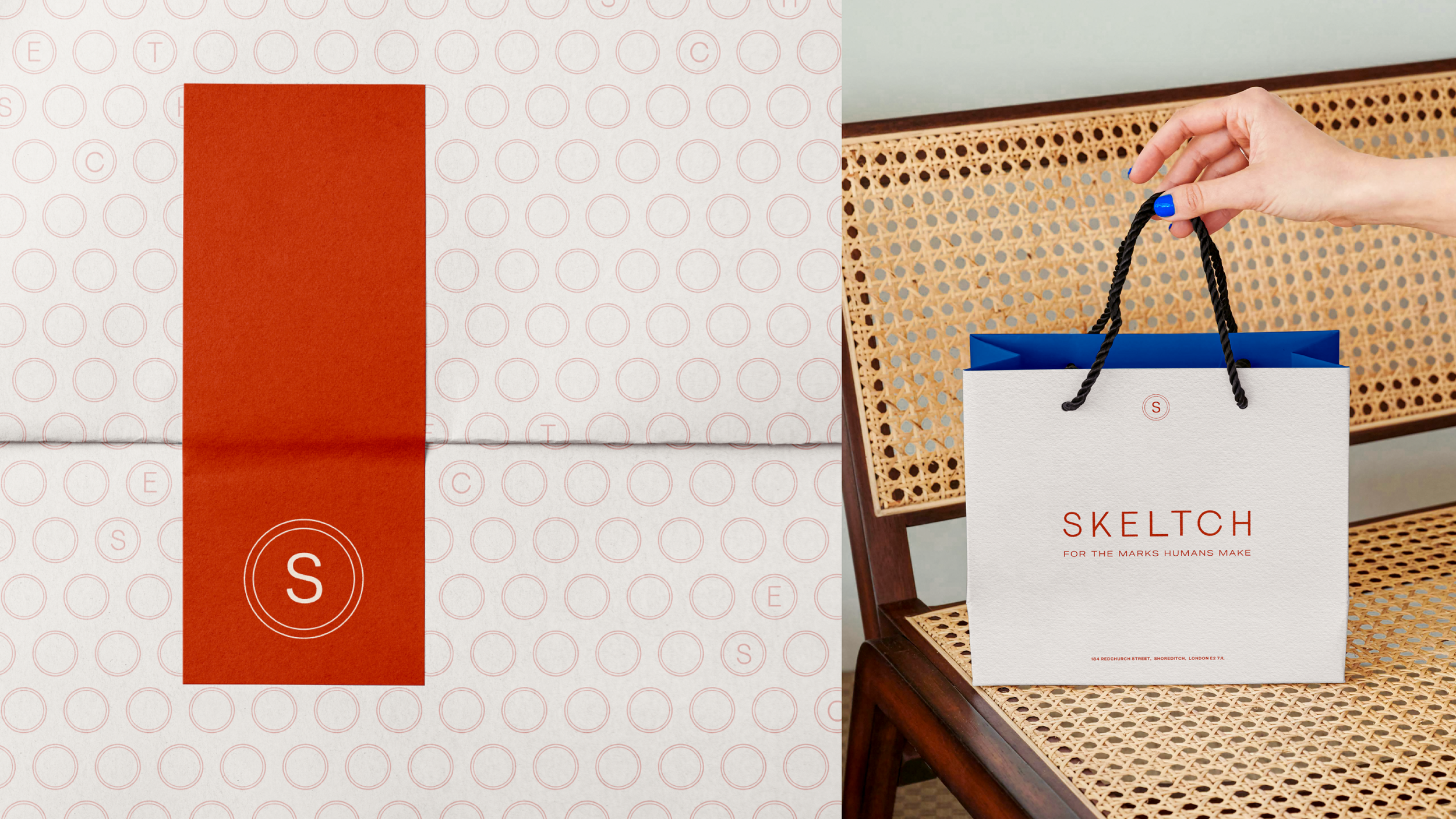
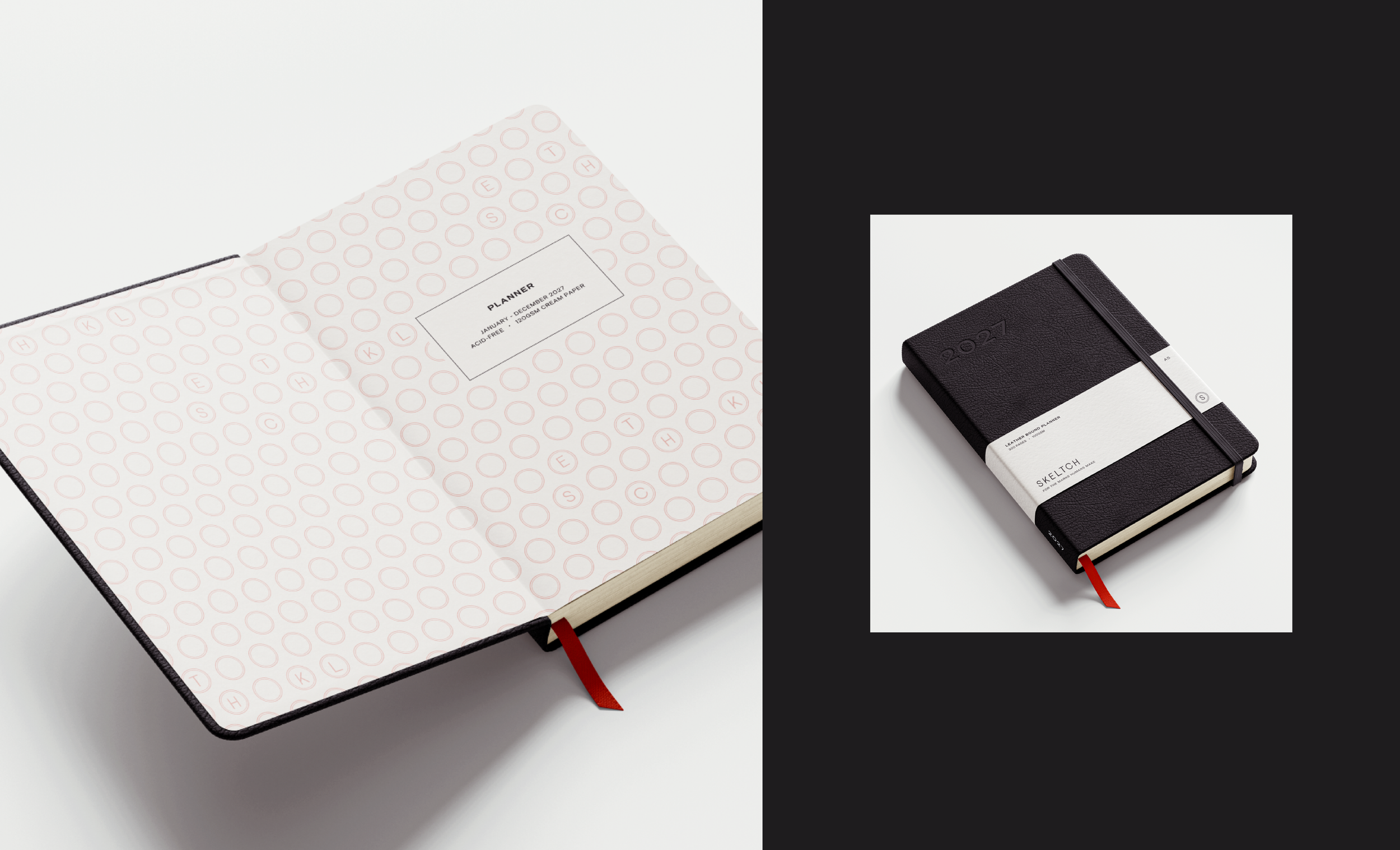
The palette is intentionally restrained: red, blue, black, and cream. This comes directly from the world of stationery purists - the essentials found on every desk: red ink, blue ink, black ink, creamy uncoated paper. The colours also nod subtly to Britishness, grounding the brand in its imagined home: a store on Redchurch Street, Shoreditch, London. The palette feels classic, utilitarian, and timeless - no trend‑driven hues, just the fundamentals.
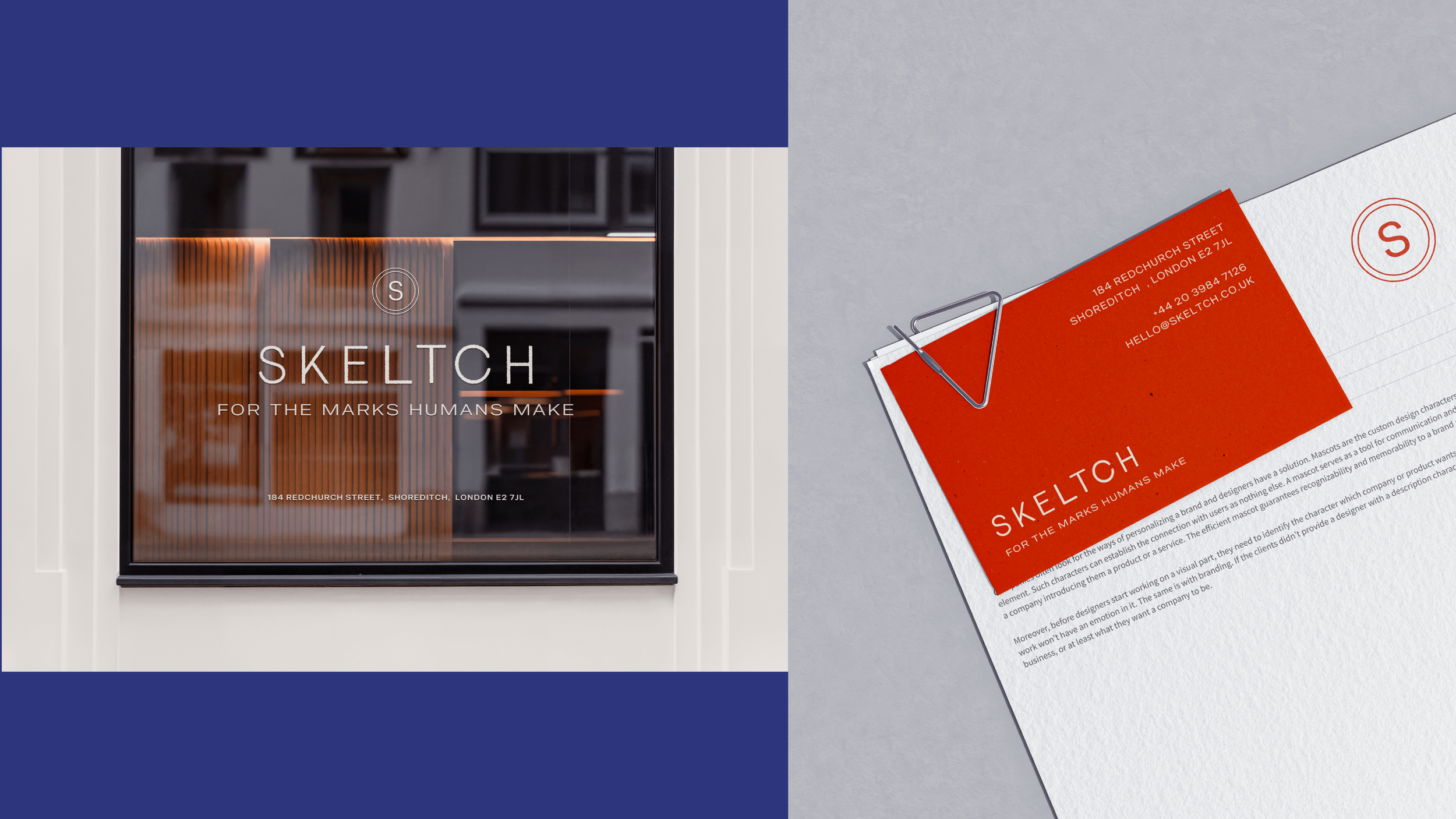
SKELTCH is intentionally unfussy. It’s a brand for people who care about good paper, quality tools and nothing else. The tone is direct, confident, and analogue‑first. No gimmicks, no digital gloss - just honest materials and human creativity.