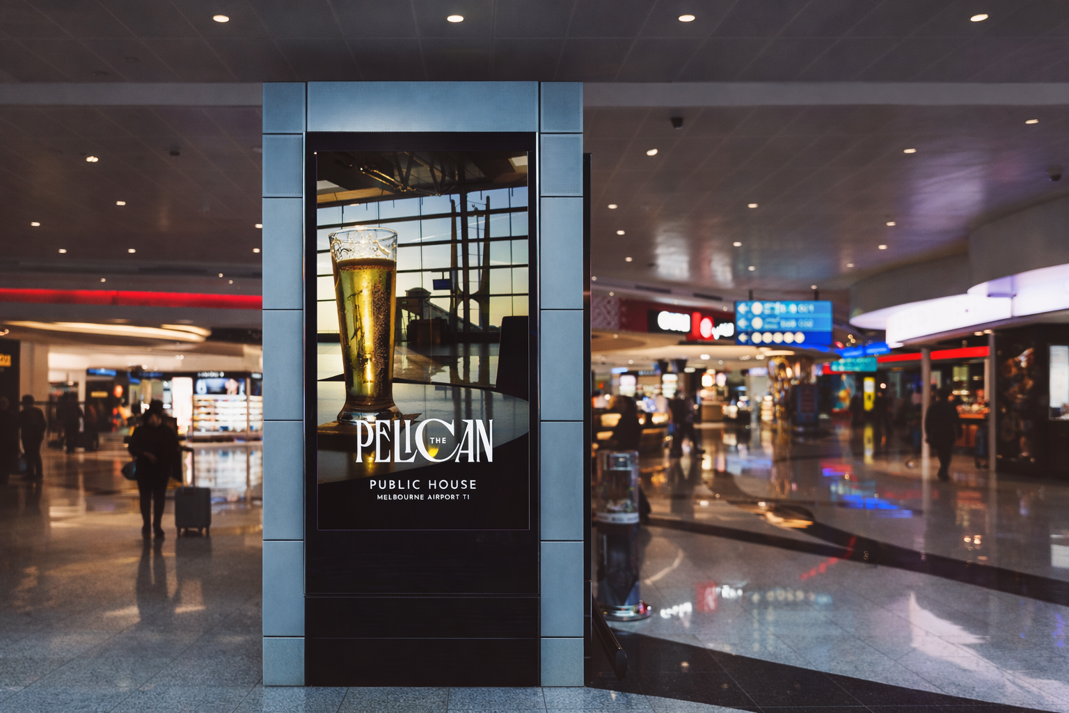
The Pelican
Bringing an Old-English pub aesthetic to Melbourne Airport.
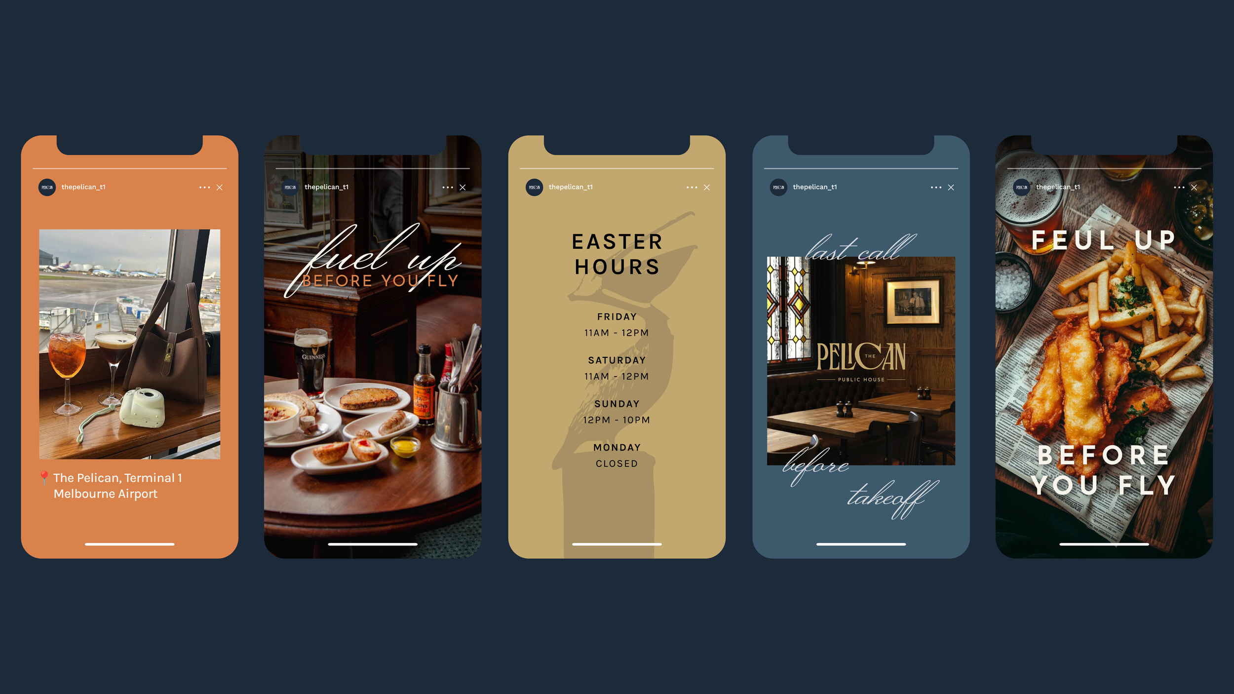
The Pelican is a brand identity created for a new pub at Melbourne Airport, inspired by the character and atmosphere of traditional English pubs. With the venue still in development at the time of the brief, the visual direction was shaped through conversations with the architects and early interior plans.
This influence informed both the interior concept and the brand’s visual language. Materials such as stained glass, Chesterfield leather, exposed timber and brick helped guide the design direction, balancing heritage cues with the practical needs of a modern travel space. A rich navy blue became the primary brand colour, chosen to complement the interior palette while subtly referencing both aviation and the pelican’s coastal habitat.
Deliverables
Brand identity
Custom logo
Illustration
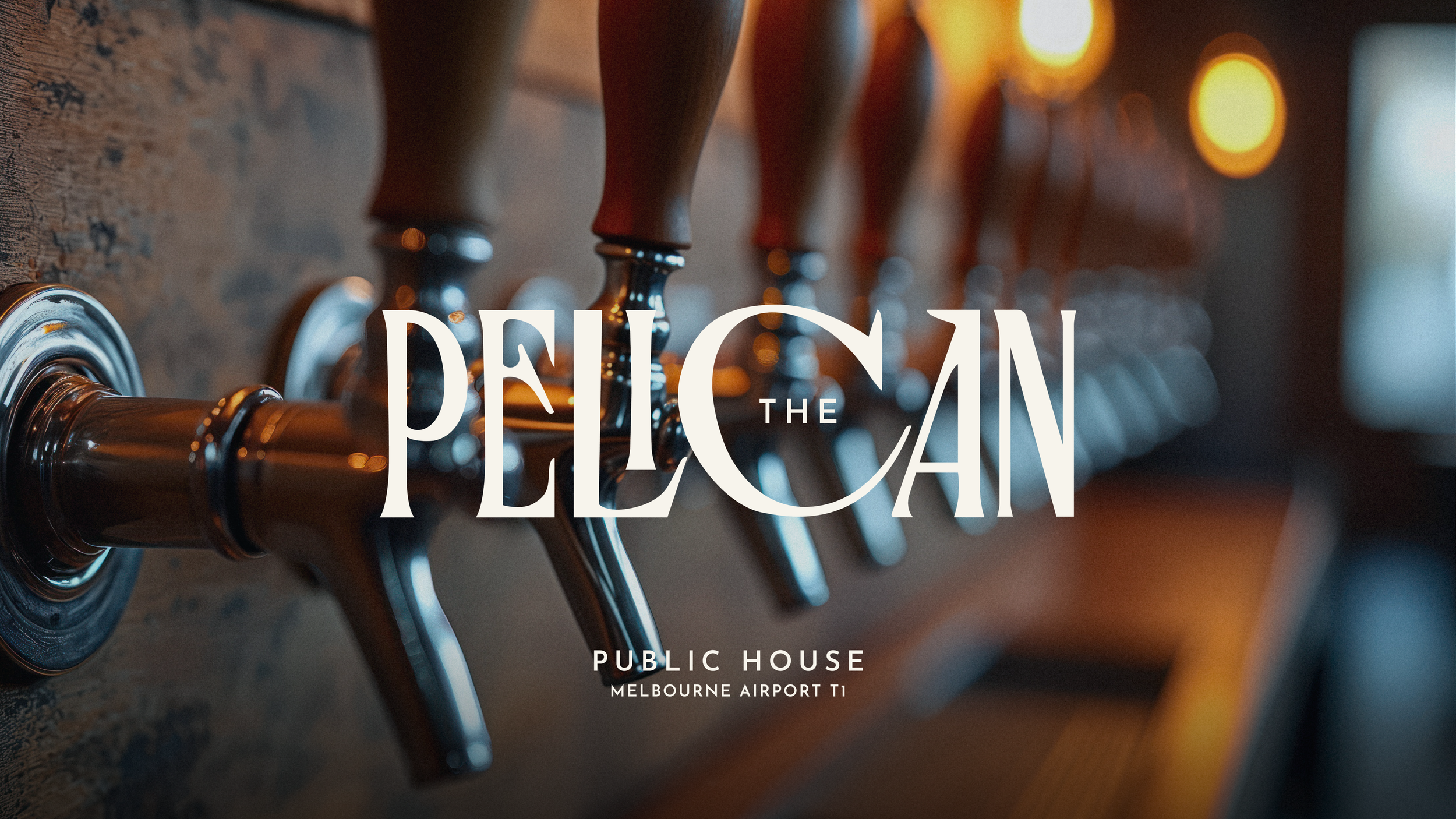
Given the name The Pelican, the identity explored ways of translating the bird’s distinctive characteristics into the typography itself. Reference imagery of pelicans informed the construction of a custom serif wordmark, where subtle details echo elements of the bird’s anatomy. Tapered terminals suggest the pointed form of a beak, while broader letter bases reference the splayed shape of webbed feet. These gestures allowed the type to carry a quiet visual link to the name without becoming overly illustrative.
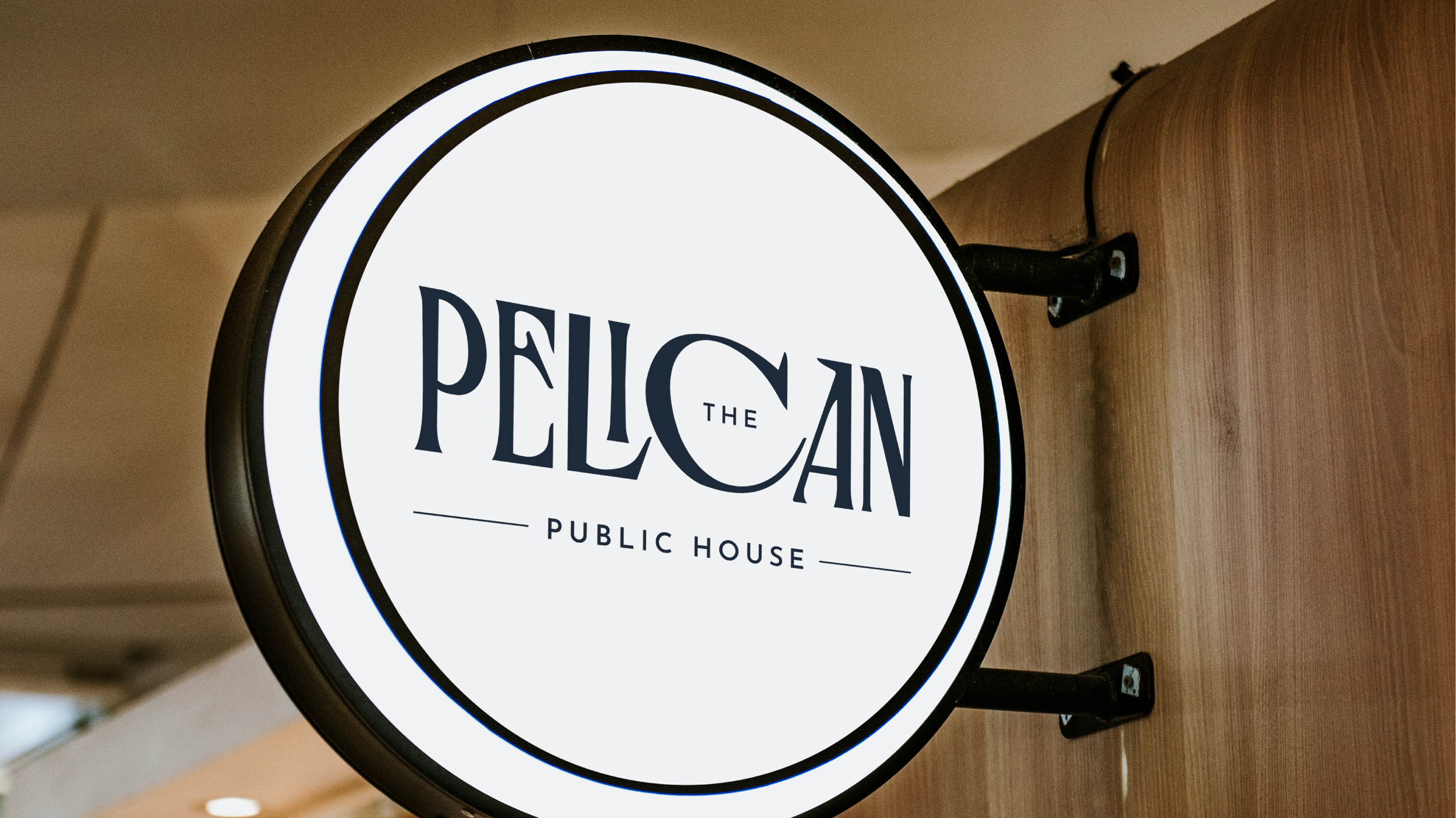
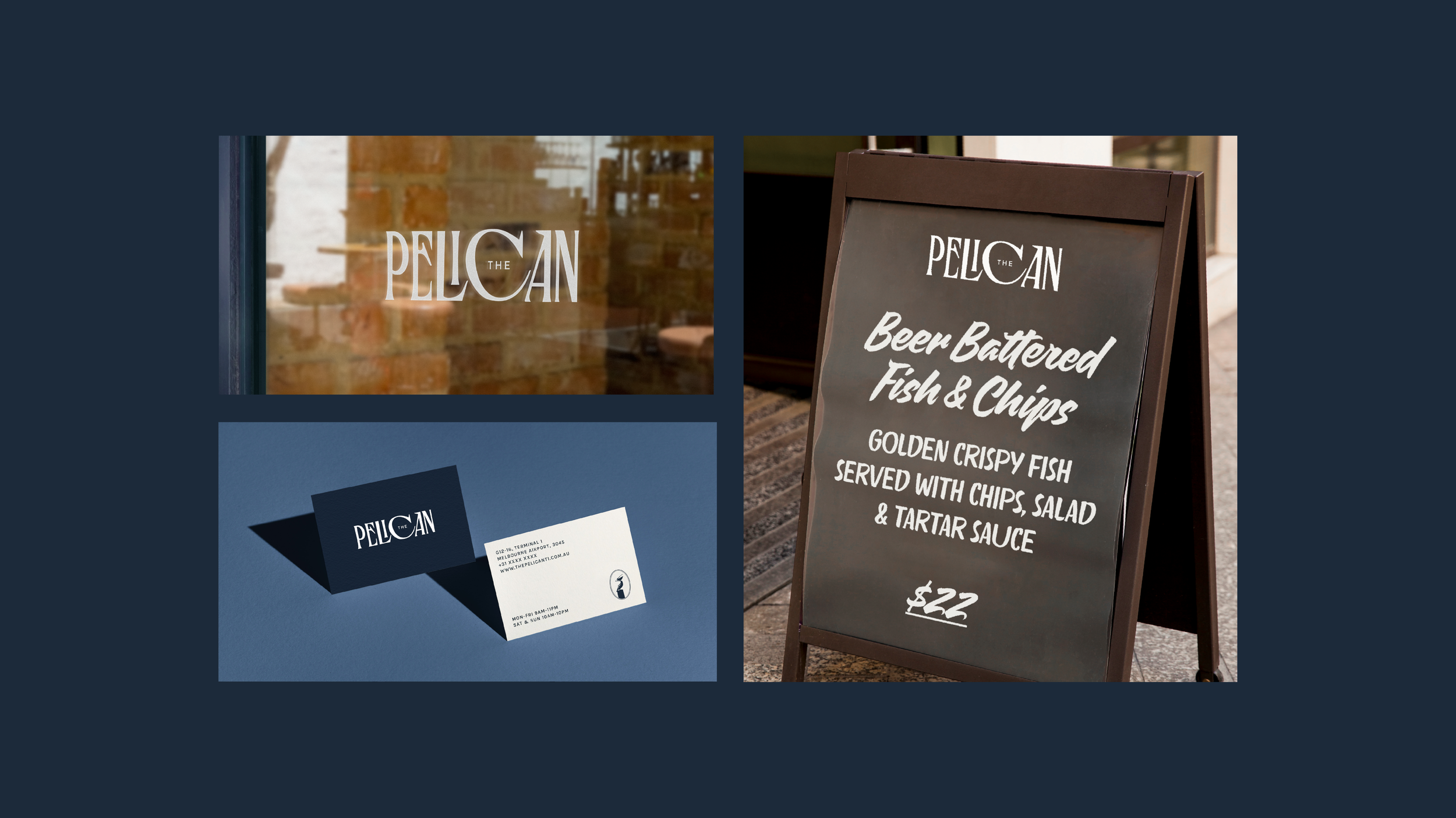
Alongside the wordmark, a simple pelican icon was created in the style of cameo silhouettes. Inspired by nineteenth-century profile portraits, the illustration echoes the vintage, Old-English aesthetic of the interiors and complements the overall brand.
Together, these elements created a brand that feels both classic and distinctive — blending traditional British pub cues with subtle references to flight and the pelican itself, while remaining clear and recognisable within the fast-paced environment of an international airport.
Photography: Adobe Stock & iStock