V - A Collection Of First Times
Transforming personal stories into expressive typographic form.
V is a typographic book exploring personal accounts of people’s first sexual experiences. Drawing on anonymous stories, the project examines how tone, emotion and memory can be communicated through typography, layout and physical book design.
Deliverables
Book Design
Typography
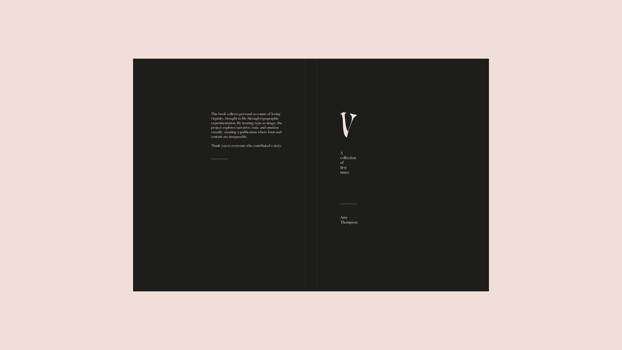
The title V nods to the coded, playful language many young people use when referring to virginity. Phrases like “your V” or “V-plates” were common among contributors when they were younger, allowing the title to resonate with a similar generation while maintaining ambiguity and respecting their experiences. Rather than stating the subject outright, the book keeps its meaning subtle and understated, letting readers discover it gradually. This sense of privacy continues in the cover design, where a smaller flap partially conceals the title, inviting the reader into something personal and intimate.
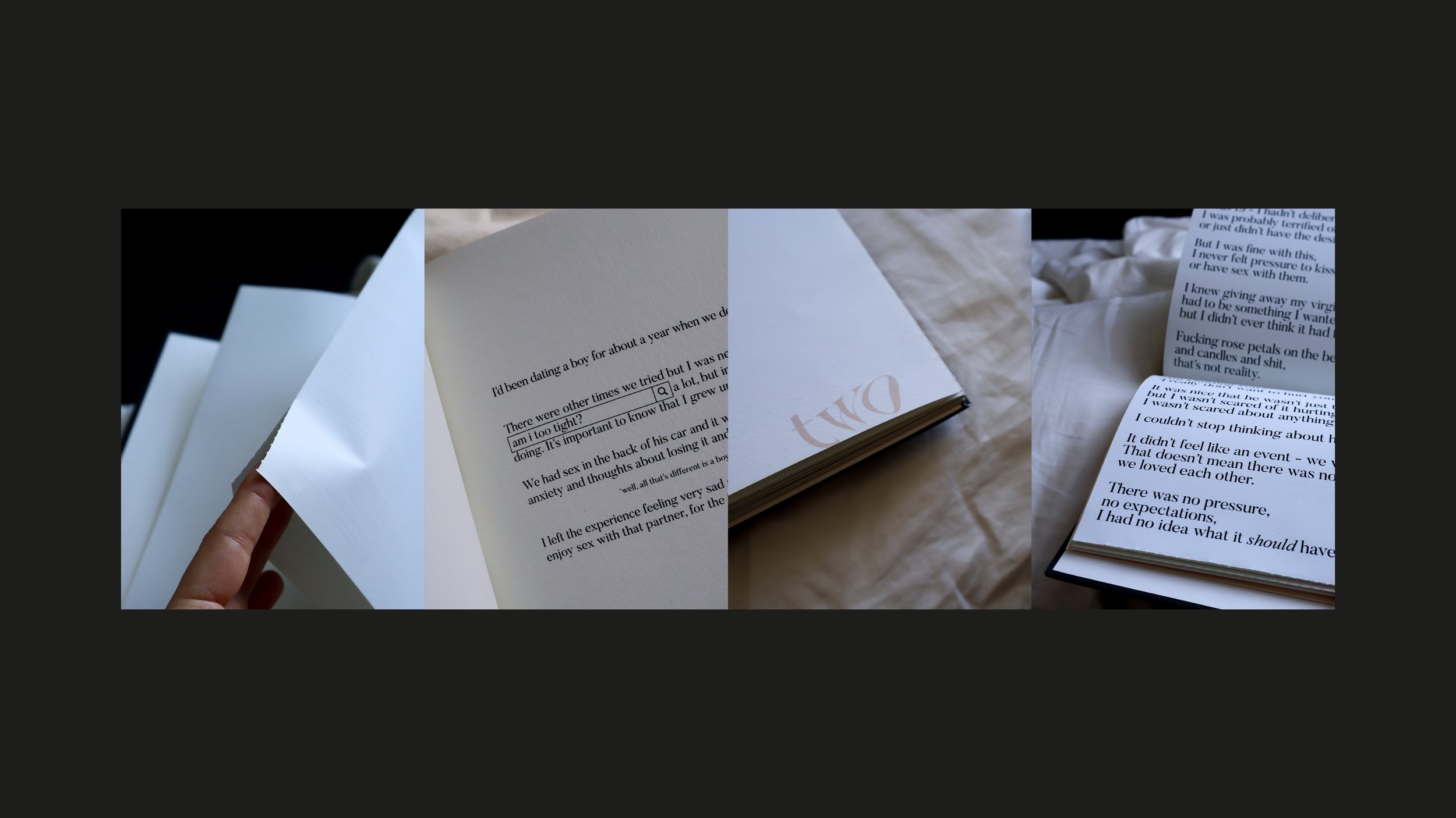
Intimacy continues inside the book, where each story is sealed using perforated French-folded pages. Readers must physically break into the pages to access the text, a deliberate gesture that mirrors the emotional significance of the experiences being shared. Each opening is unique: pages can bend, crease or dent differently, making each encounter with the story distinct and personal to the reader, just as each account is unique to the contributor.
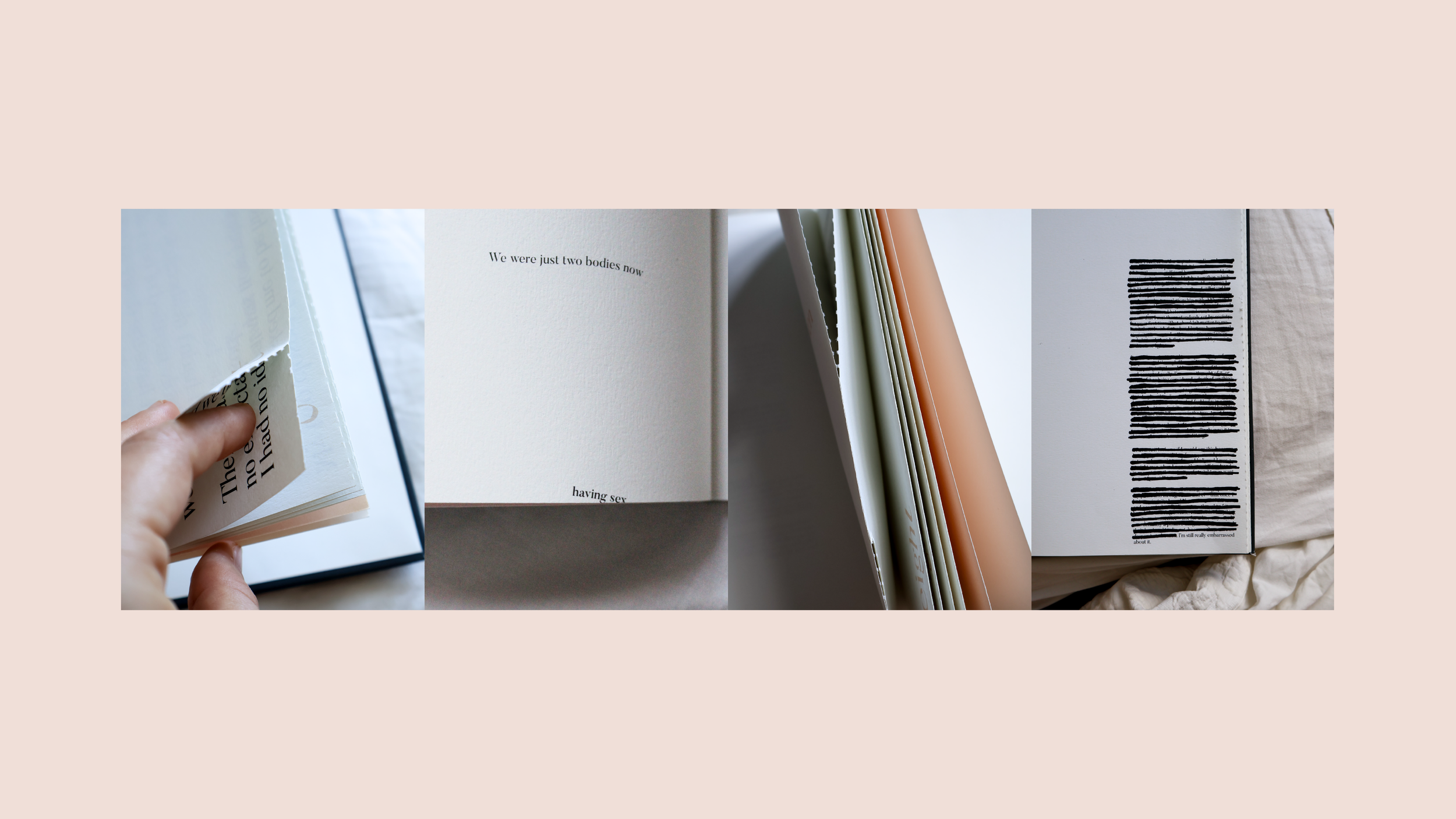
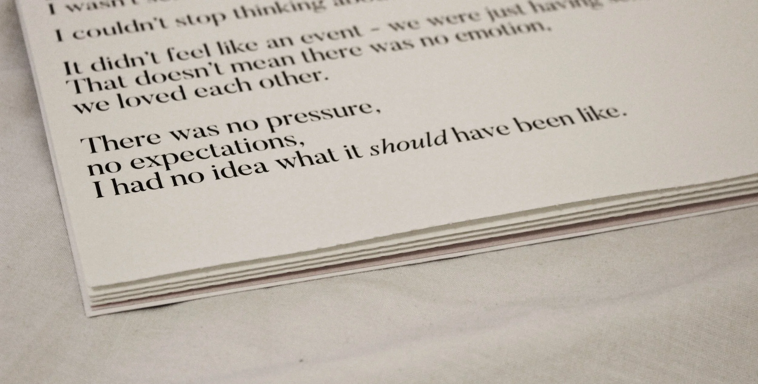
Typography becomes the primary storytelling device throughout the book. A traditional serif typeface forms the foundation of the design, chosen for its strong associations with literature, publishing and long-form storytelling. This formal typographic voice contrasts with the private, often taboo subject matter. Key elements — including the numbered accounts and the V on the cover — are subtly warped, stretched and resized from their original serif character. This recurring visual motif reflects the tension between expectations and reality surrounding first sexual experiences, acknowledging that these moments, like the opening of the folded pages, rarely unfold in the neat or idealised ways they are often imagined.
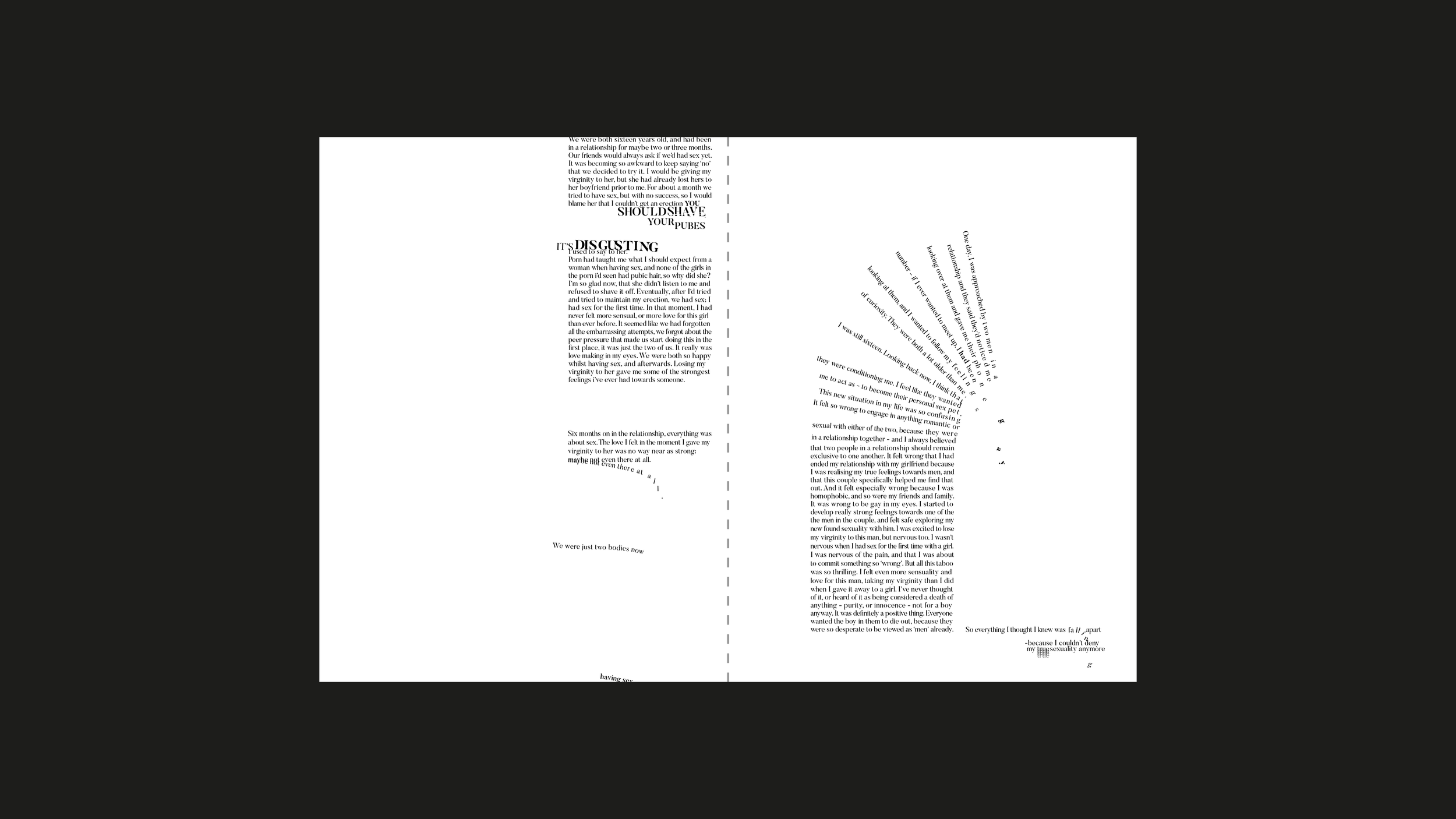
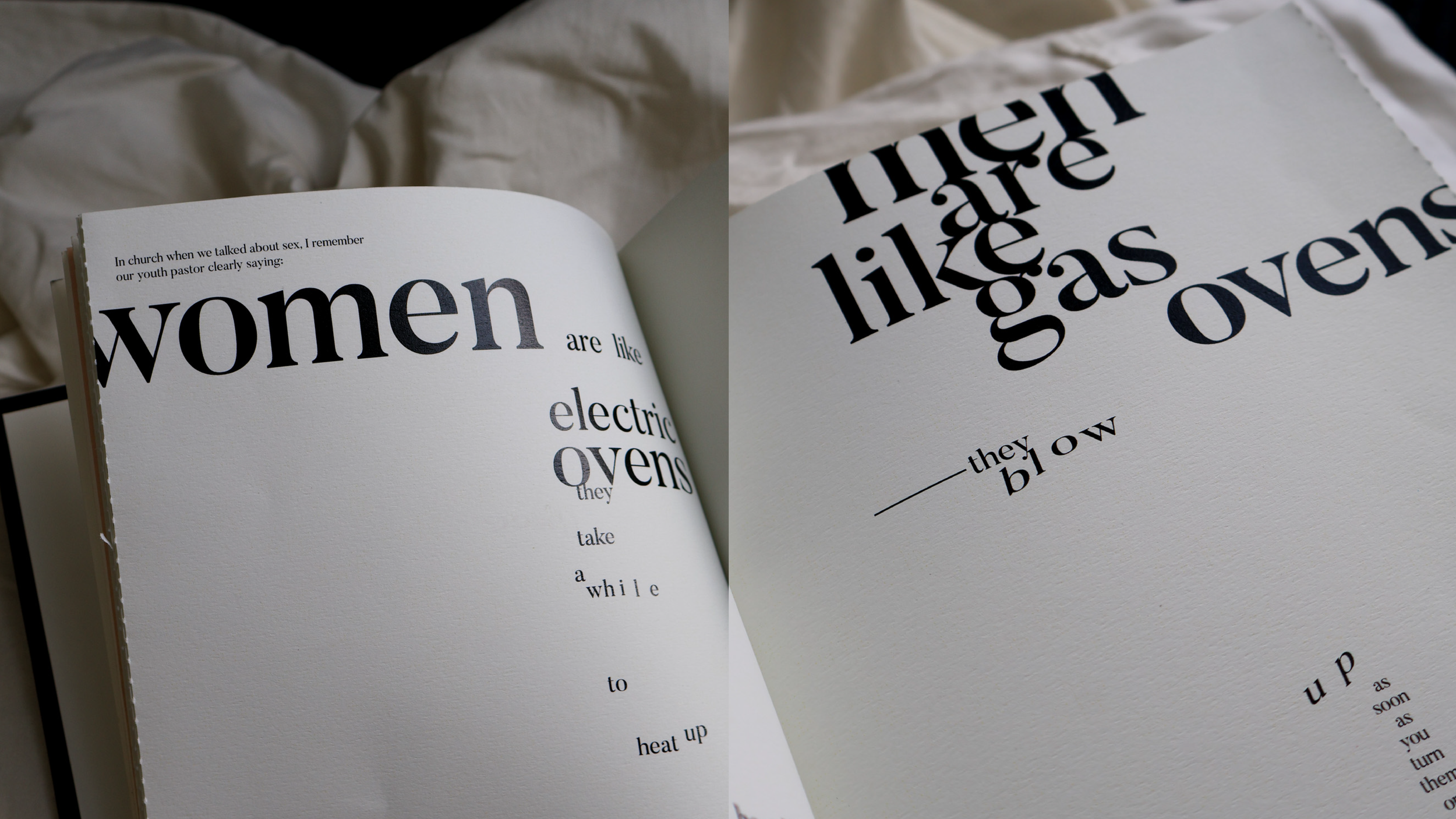
Each story is treated uniquely, with typography shaping the tone and rhythm of the account. Some text appears partially redacted or tightly packed, reflecting embarrassment, discomfort, or shyness, while elongated type stretches out words to convey drawn-out speech, ironic humour, or sarcastic emphasis. Chaotic accounts fragment and fall across the page, intersecting diagonally to show multiple thoughts colliding. Inserts in side columns indicate physical actions — a sigh, an eye-roll, or other gestures not spoken aloud. Small visual motifs can be found throughout paragraphs, such as search-bar references, hinting at uncertainty, reflecting how people often turn to the internet when navigating unfamiliar experiences.
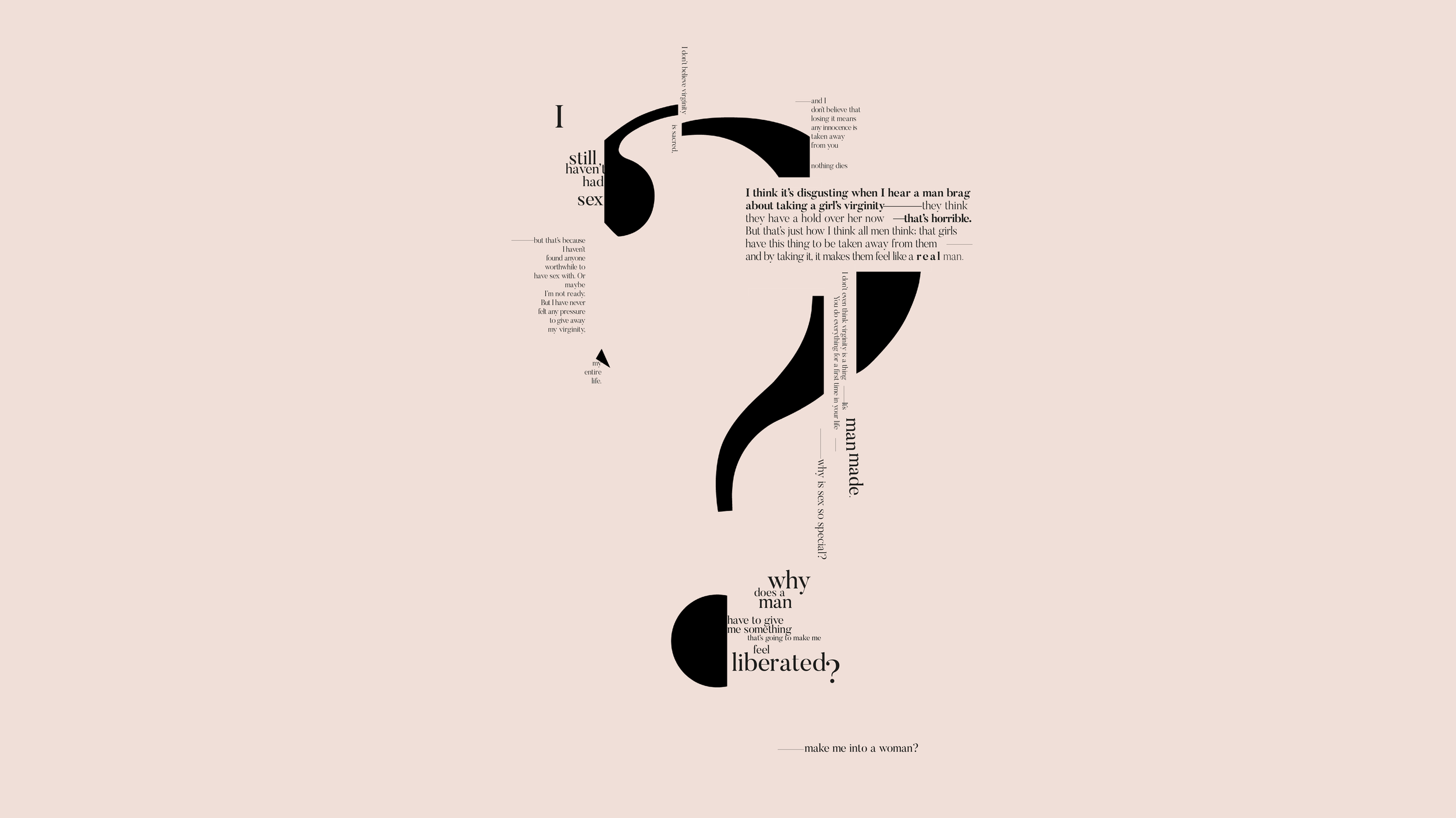
Together, these typographic interventions transform the book into more than a collection of stories. Instead, it becomes a study of how design can interpret voice, emotion and memory — using type not only to present language, but to embody the experience behind it.
Photography: Amy Thompson